week 3
Learning Aims and Objectives:
Aim: In this week's page, students will learn the
Objectives:
1. By the end of this week's page students will be able to use and adapt problem analysis tools and approaches to diagnose or identify areas of fault or issue..
2. By the end of the week's page students will be able to create personal straterges to support them in thier diagnosis and analysis of issues and faults within thier own practices and, future practices.
P3.3 Root cause analysis approaches and their applications within problem management:
The 5 ‘whys’
An iterative questioning technique, the 5 Whys is a simple but effective way to get to the bottom of a problem by asking “why” five times, or more if needed. It’s like peeling back layers of an onion, going deeper each time until you find the true cause of the issue, not just the surface-level problem.
Here’s how it works:
• You start by identifying the problem.
• Then, you ask why the problem happened.
• After you get the first answer, you ask why again to dig deeper.
• You keep repeating this process, usually about five times, until you uncover the root cause of the issue.
In digital support services, this technique helps teams figure out why things go wrong, whether it’s related to technology not working, users having issues, or systems failing. By understanding the true cause, companies can fix problems effectively and prevent them from happening again.
Example Case Studies in Digital Support Services:
1. Slow Website Performance
• Problem: Users report that a website is loading slowly.
• 1st Why: Why is the website slow? Because the server response time is long.
• 2nd Why: Why is the server response time long? Because it’s overloaded with too many requests.
• 3rd Why: Why are there too many requests? Because a lot of bots are making fake requests.
• 4th Why: Why are bots making fake requests? Because there’s no filtering system in place to block them.
• 5th Why: Why is there no filtering system? Because it wasn’t set up during the website’s initial configuration.
• Solution: Set up a bot-blocking system to reduce server load and improve performance.
2. Customer Complaints About Software Crashing
• Problem: A company’s support team receives multiple complaints that their app is crashing.
• 1st Why: Why is the app crashing? Because it’s running out of memory.
• 2nd Why: Why is it running out of memory? Because it’s using too much data.
• 3rd Why: Why is it using too much data? Because the images in the app are not compressed.
• 4th Why: Why aren’t the images compressed? Because the developers didn’t optimize them.
• 5th Why: Why weren’t the developers optimizing images? Because they weren’t aware of the issue until users complained.
• Solution: Train developers on data optimization and perform regular app performance tests.
3. Repeated Failed Logins by Customers
• Problem: Customers are having trouble logging into their accounts.
• 1st Why: Why can’t they log in? Because their passwords are being rejected.
• 2nd Why: Why are passwords being rejected? Because the system doesn’t recognize them.
• 3rd Why: Why doesn’t the system recognize them? Because some users are resetting their passwords repeatedly.
• 4th Why: Why are they resetting their passwords repeatedly? Because they can’t remember them.
• 5th Why: Why can’t they remember their passwords? Because the system has strict password requirements that are hard to remember.
• Solution: Implement a more user-friendly password recovery system or use passwordless login methods like biometrics or magic links.
The 5 Whys technique helps digital support services dig deeper to find solutions that aren’t just quick fixes but address the real problem, saving time and improving user experiences in the long run.
5 Whys Game
Objective:
This activity helps students understand the 5 Whys technique by creating a game where they identify the root cause of a problem. It encourages teamwork, critical thinking, and communication skills.
Setup:
• Split the class into pairs (Pair A and Pair B).
• Each pair will create a simple problem scenario and guide the other pair through the 5 Whys questioning process to find the root cause.
• After creating their scenarios, the pairs will swap and solve each other’s problem using the 5 Whys method.
Instructions:
Part 1: Creating the Problem Scenario (10-15 minutes)
1. Create a Problem: In each pair, students come up with a fictional problem for the other pair to solve. The problem should be related to everyday experiences like technology, school, or a common inconvenience. The problem can be simple, such as:
• “The Wi-Fi isn’t working.”
• “A game console keeps freezing.”
• “The printer won’t print.”
2. Think of the Root Cause: After creating the problem, the pair should also come up with a potential root cause of the issue (e.g. Wi-Fi router is out of date, or the console needs an update) to make sure they can guide the other pair toward the answer.
3. Develop Hints: Prepare answers for each of the 5 Whys steps that will eventually lead to the root cause. Make sure the hints lead the problem-solvers to dig deeper, but don’t give away the solution immediately.
Example:
• Problem: “The laptop won’t turn on.”
• Why #1: Why isn’t the laptop turning on? (The battery is dead.)
• Why #2: Why is the battery dead? (It wasn’t charged overnight.)
• Why #3: Why wasn’t it charged overnight? (The charger wasn’t plugged in properly.)
• Why #4: Why wasn’t it plugged in properly? (The power strip was switched off.)
• Why #5: Why was the power strip switched off? (It was switched off to save power, but the student forgot to turn it back on before charging.)
Part 2: Swapping and Solving (10-15 minutes)
1. Swap Problems: Once both pairs have completed their problem scenarios, they swap with another pair. Now each group has a new problem to solve using the 5 Whys technique.
2. Solve the Problem:
• The pair solving the problem will ask “why” questions, starting with the surface problem.
• The other pair (the creators of the problem) will provide answers based on the hints they prepared.
• The goal is for the solvers to identify the root cause after asking at least 5 “why” questions.
3. Reflection: After solving, each pair should discuss:
• Did they reach the root cause? How difficult was it to ask the right “why” questions?
• Were the answers clear, or did they need more information?
• How did this process help them understand the problem better?
Part 3: Group Discussion (5-10 minutes)
After both pairs have completed the activity, come together as a class to reflect on the experience. Ask students:
• What challenges did they face when asking “why”?
• Did anyone find a different root cause than expected?
• How can this technique be useful in real life, especially in areas like technology or problem-solving?
Extensions:
• Role Reversal: Have the pairs switch roles again and create new problems.
• Real-World Scenarios: Ask pairs to think of real issues they’ve encountered in their daily lives (like a broken phone charger or app not working) and apply the 5 Whys.
This activity is designed to be fun, engaging, and hands-on, helping students apply the 5 Whys technique in a creative way while working together!
Fishbone diagram
A Fishbone Diagram, also known as a Cause and Effect Diagram or Ishikawa Diagram, is a visual tool used to identify and organise potential causes of a problem or effect. The diagram resembles a fish skeleton, where the “head” represents the main problem, and the “bones” branching off represent different categories of causes. The concept was developed by Kaoru Ishikawa, a Japanese quality control expert, in the 1960s.
Key Components
1. Head: The problem or effect you want to analyse (e.g., “Customer Satisfaction Issues”).
2. Spine: The central line leading to the head.
3. Bones: Major categories of causes that contribute to the problem. Common categories include:
• People: Issues related to staff performance or training.
• Processes: Problems in how services are delivered or tasks are completed.
• Technology: Issues with software, hardware, or tools used.
• Materials: Resources and materials that might affect the outcome.
• Environment: External factors that impact the situation.
Application in Digital Support Services
In the context of digital support services, a Fishbone Diagram can help teams identify the root causes of issues that customers face, leading to more effective solutions. Here’s how it can be used:
1. Identifying Technical Problems: For example, if a company receives complaints about its online support portal being difficult to navigate, a Fishbone Diagram can help identify whether the issues stem from:
• Poor user interface design (Technology)
• Lack of training for support staff (People)
• Ineffective processes for addressing user queries (Processes)
2. Improving Customer Service: If customer satisfaction scores are low, the Fishbone Diagram can break down potential causes, such as:
• Slow response times (Processes)
• Insufficient staff training (People)
• System crashes or bugs (Technology)
Case Studies and Examples
1. Case Study: A Software Company
A software company used a Fishbone Diagram to analyse customer complaints about their software’s performance. They identified several root causes:
• People: Inadequate training for users.
• Processes: Complicated installation processes.
• Technology: Software bugs that were not resolved quickly.
By addressing these areas, they improved user experience and reduced complaints.
2. Case Study: An E-Commerce Retailer
An e-commerce retailer faced declining sales due to cart abandonment. They used a Fishbone Diagram to analyse the situation:
• Processes: Complicated checkout process.
• Technology: Mobile website issues.
• Environment: High shipping costs.
This analysis led them to simplify the checkout process and improve their mobile site, resulting in increased sales.
Articles and Resources
Here are some articles and resources for further reading on Fishbone Diagrams and their application in digital support services:
1. MindTools - Cause and Effect Analysis: Link
2. Creative Safety Supply - Fishbone Diagram: Link
3. ASQ - Cause and Effect Diagram: Link
4. Quality Management Solutions - The Fishbone Diagram: Link
Utilising a Fishbone Diagram can assist teams in digital support services in understanding and tackling the root causes of problems, ultimately leading to improved customer satisfaction and service delivery.
Fault Finding Using Fishbone Diagrams
Objective
In this activity, you will practice using Fishbone Diagrams to identify and analyse the potential causes of a specific fault or problem within a fictional scenario. This task will help you develop your critical thinking and problem-solving skills.
Time Required
30 minutes
Scenario: Café Delights
Background:
Café Delights is a popular coffee shop that has recently been experiencing a decline in customer satisfaction. Customers have complained about various issues, including slow service, incorrect orders, and cleanliness. The management wants to identify the root causes of these problems in order to improve the customer experience.
Task Instructions
1. Set Up Your Diagram:
• On a piece of paper or using a digital drawing tool, draw a large horizontal arrow pointing to the right. At the head of the arrow, write the main problem: “Decline in Customer Satisfaction”.
• Draw several diagonal lines (bones) branching off from the spine of the arrow. These lines will represent different categories of potential causes.
2. Identify Categories:
Use the following categories to organise your causes:
• People: Issues related to staff performance or training.
• Processes: Problems with how orders are taken or prepared.
• Technology: Any issues with the equipment used (e.g., coffee machines, order systems).
• Environment: Factors related to the café’s atmosphere (e.g., cleanliness, seating).
• Materials: Quality or availability of ingredients (e.g., coffee, pastries).
3. Brainstorm Causes:
In each category, brainstorm potential causes that could contribute to the decline in customer satisfaction. Here are some examples to get you started:
• People:
• Are the staff adequately trained?
• Is there high staff turnover affecting service quality?
• Are staff members friendly and attentive?
• Processes:
• Is the ordering process efficient?
• Are there delays in food preparation?
• Is there a lack of communication between front-of-house and kitchen staff?
• Technology:
• Are the coffee machines functioning properly?
• Is the point-of-sale system causing delays?
• Is there a reliable Wi-Fi connection for customers?
• Environment:
• Is the café clean and well-maintained?
• Are there enough seats for customers during peak hours?
• Is the café atmosphere inviting?
• Materials:
• Are ingredients fresh and of good quality?
• Are there shortages of popular menu items?
• Is there proper inventory management?
4. Complete Your Diagram:
After brainstorming, fill in your Fishbone Diagram with the causes you identified. Write each cause on the corresponding bone, ensuring it is easy to read.
5. Discussion and Reflection:
Once you have completed your Fishbone Diagram, discuss your findings with a partner or in a small group. Consider the following questions:
• Which category has the most causes?
• Are there any causes that stand out as particularly impactful?
• What immediate actions could Café Delights take to address these issues?
Conclusion
This exercise will help you understand how to use Fishbone Diagrams for fault finding and problem analysis. By breaking down the issue of declining customer satisfaction at Café Delights, you can identify potential solutions to improve the customer experience.

Failure mode and effects analysis (FMEA)
Identifies which parts of the process or system are faulty
In the digital support services industry, Failure Mode and Effects Analysis (FMEA) can be highly valuable in ensuring reliability, minimising downtime, and improving the overall customer experience. The industry relies on complex digital systems, software platforms, and networks, where failures can have significant operational and business impacts. Here’s how FMEA can be contextualised within this sector:
1. Failure Modes in Digital Support Services
• Software Failures: These could include bugs, crashes, or incompatibilities in the software used to provide support services. A failure might prevent users from accessing critical support tools or resources.
• Network Downtime: Disruptions in network connectivity that hinder communication between support teams and customers, leading to delays in problem resolution.
• Data Breaches or Cybersecurity Issues: Failures in protecting customer data can lead to breaches, data loss, or unauthorised access, which are critical in digital services.
• Poor Integration: Incompatibility between various software systems or tools used in support services, causing disruptions in the workflow or poor user experiences.
2. Effects of Failure
• Customer Dissatisfaction: Failures can lead to delays in resolving customer issues, causing frustration and possibly losing customers.
• Operational Downtime: Extended periods of system unavailability affect the ability of the support team to operate efficiently, impacting overall service delivery.
• Reputation Damage: Cybersecurity issues or consistent service failures can damage the organisation’s reputation, eroding trust with clients.
• Financial Losses: Unplanned outages, lost productivity, and reputational damage can lead to financial consequences, either through lost business opportunities or costs associated with fixing the issues.
3. Severity, Occurrence, and Detection in Digital Support Services
• Severity (S): For digital support services, severity can range from minor inconveniences (e.g., slow service) to critical issues such as complete system shutdowns, impacting service-level agreements (SLAs).
• Occurrence (O): In a digital environment, failure modes with high occurrence might include recurring software bugs, frequent network interruptions, or continual user-reported issues.
• Detection (D): Early detection of failure modes could involve automated monitoring tools, error logs, or customer feedback systems. Failures that are hard to detect, such as latent cybersecurity vulnerabilities, would rank high on the detection scale.
4. Risk Priority Number (RPN)
• In digital support services, the RPN helps identify where proactive improvements are most needed. For example, a failure mode such as a data breach, with high severity (due to legal and reputational risks), moderate occurrence, and low detectability, would have a high RPN. This would signal the need for immediate attention, such as implementing stronger cybersecurity measures or monitoring systems.
5. Mitigation and Prevention in Digital Support
• Automated Monitoring Tools: To minimise occurrences of network and software failures, companies can implement real-time monitoring systems that alert teams when failures are likely to occur.
• Redundant Systems: In the case of network downtime, having redundant systems or backup networks can ensure continued service even if the primary system fails.
• Patch Management and Software Updates: Regularly updating software and applying patches can prevent common bugs and vulnerabilities that lead to system failures.
• Cybersecurity Protocols: Stronger encryption, multi-factor authentication, and real-time threat detection can mitigate the risk of data breaches and security-related failures.
FMEA as a Learning Tool in Digital Support Services:
In this industry, FMEA becomes a proactive learning model for continuously improving digital infrastructure. By routinely analysing failure modes, companies can:
• Enhance their incident response protocols to minimise customer impact.
• Build resilience into their systems by identifying critical failure points before they cause major service disruptions.
• Foster continuous improvement in service delivery by learning from previous failures, which in turn improves customer satisfaction and operational efficiency.
FMEA helps digital support service providers identify and prioritise potential failures, mitigate risks, and enhance overall system reliability, which is crucial for maintaining high levels of service quality and customer trust.
Activity: Failure Mode and Effects Analysis (FMEA) in Digital Support Services
Duration: 30 minutes
Target Audience: IT Students
Failure Mode and Effects Analysis (FMEA) with an application in Digital Support Services
Activity Overview:
In this activity, students will apply the principles of FMEA to identify potential failure modes in a common Digital Support Services scenario, evaluate the impact, and develop strategies to mitigate these risks. This practical exercise will enhance their problem-solving skills and understanding of risk management in IT service delivery.
Learning Objectives:
• Understand the purpose and process of FMEA.
• Apply FMEA to a real-world Digital Support Services scenario.
• Identify failure modes, their effects, and possible mitigation strategies.
• Present findings in a structured manner.
Scenario: User Account Management System
You work in a Digital Support Services team responsible for managing a company’s User Account Management System. This system handles user account creation, password resets, role assignments, and account deactivation. Ensuring this service operates smoothly is critical to business continuity and user satisfaction.
Task Breakdown (30 minutes):
1. Introduction to FMEA (5 minutes):
• Brief overview of what FMEA is: A structured approach to identifying and evaluating potential failures in a process, system, or product and their effects.
• Explain how FMEA can be applied to Digital Support Services—e.g., improving system reliability, preventing service outages, and enhancing user experience.
2. Group Work: Failure Mode Identification (10 minutes):
Divide students into small groups (3-5 members). Each group will brainstorm potential failure modes in the User Account Management System.
Examples of Failure Modes:
• Incorrect password resets (users unable to reset their passwords due to system errors).
• Delayed account activation (users not receiving timely access to their accounts).
• Misassigned user roles (users receiving incorrect permissions).
• Security vulnerabilities (users gaining unauthorised access).
3. FMEA Analysis (10 minutes):
Each group will use the FMEA method to analyse one or two failure modes identified earlier.
For each failure mode, they must:
• Identify the potential effects (e.g., user frustration, system downtime).
• Rate the severity (how serious the effect is on the system or users) on a scale of 1 to 10.
• Identify the causes (e.g., human error, software bugs, incorrect configurations).
• Rate the occurrence (likelihood of the failure happening) on a scale of 1 to 10.
• Identify current controls (e.g., automated password reset system).
• Rate the detection (how likely the system can detect the failure before it occurs) on a scale of 1 to 10.
• Suggest improvements to reduce the risk of failure (e.g., better user training, enhanced system logging).
4. Presentation and Discussion (5 minutes):
Each group will present one failure mode and their FMEA analysis to the class, focusing on the failure’s severity, likelihood of occurrence, and proposed solutions. The instructor and other groups can ask questions and provide feedback.
Example to Support Understanding:
Failure Mode: Incorrect Password Resets
• Effect: Users are unable to access the system, leading to frustration, productivity loss, and increased support calls.
• Severity: 8 (high, since access is crucial for daily operations).
• Cause: Incorrect configuration of the password reset system or outdated email templates.
• Occurrence: 5 (moderate, occurs occasionally but not frequently).
• Current Controls: Automated password reset tool, email notifications.
• Detection: 6 (moderate, failures are reported by users, but the system does not automatically detect the issue).
• Suggested Improvement: Introduce a monitoring system that alerts support staff when password resets fail and implement regular audits of the reset tool.
Expected Outcome:
Students will gain a practical understanding of FMEA as a tool for improving Digital Support Services by identifying and addressing potential failure points. The exercise will also help them develop teamwork and presentation skills as they discuss their findings and propose solutions.
Materials Required:
• FMEA templates (paper or digital)
• Scenario description (provided in the activity)
• Whiteboard/flip chart for group presentations

Event tree analysis (ETA)
Event Tree Analysis (ETA) is a method used to evaluate how an event or failure could progress and what consequences it might lead to. It starts with a single event, called an “initiating event”, and from there, branches out like a tree, showing different possible outcomes. This analysis is especially useful in safety and risk assessments because it helps identify how different systems, processes, or actions can either stop or allow the event to get worse.
How ETA Works:
1. Identify the initiating event – This could be anything, from a system error to a power outage.
2. Identify the systems or processes designed to respond – For each step, there might be safety systems or processes that can either work (success) or fail (failure).
3. Create branches for each decision point – If something works, the branch leads to a positive outcome. If something fails, the branch leads to a more negative outcome.
4. Evaluate consequences – Each branch ends in a possible outcome, ranging from “nothing happens” to a serious failure.
Example Situations in Digital Support Services:
In digital support services, where businesses provide technical help and maintain digital infrastructure, ETA can help assess risks related to system failures or cyber-attacks.
Example 1: System Outage in a Cloud Service Provider
Imagine a situation where a cloud service provider (like Google Cloud or Amazon Web Services) experiences a major power
Activity:
Event Tree Analysis (ETA) in Digital Support Services
Objective:
To research and understand how Event Tree Analysis (ETA) can be applied in digital support services, particularly focusing on system failures, cyber-attacks, or technical errors. Students will present their findings in a 5-minute presentation, showing their understanding of ETA and how it applies to real-world scenarios.
Instructions:
1. Choose a Scenario:
• Select a situation in digital support services where ETA could be applied. Examples include:
• A cyber-attack on a company’s network.
• A system failure or outage in a cloud service provider.
• A technical error in a data centre causing partial downtime.
• Think about what the initiating event might be, and what the potential outcomes could be, based on whether systems work or fail.
2. Research ETA in Digital Systems:
• Spend 10-15 minutes researching the use of Event Tree Analysis in the context of digital systems. Use the following guiding questions:
• What is ETA, and how does it help assess risk?
• How does ETA apply in scenarios like system failures or cyber-attacks?
• What are some real-world examples where ETA has been used in digital services?
3. Sources for Research:
• Health and Safety Executive: Event Tree Analysis – A basic guide to ETA and how it works.
• ScienceDirect: Event Tree Analysis – A detailed overview of ETA and its applications.
• Cloud Computing Incidents Database – Real-world cases of cloud service outages and failures, which can be useful for examples.
• Cyber Security and Infrastructure Agency (CISA) – Information on cyber-attacks and system vulnerabilities.
4. Create a Presentation:
• Spend 15 minutes compiling your findings into a short presentation. Your presentation should include:
• A brief explanation of Event Tree Analysis.
• The scenario you selected (e.g., system failure, cyber-attack) and its potential consequences.
• A simple event tree diagram showing the possible outcomes (you can draw this or create it digitally).
• A conclusion explaining why ETA is useful in digital support services.
5. Presentation Requirements:
• The presentation should last 5 minutes.
• Be ready to explain your event tree and how you arrived at the possible outcomes.
Pareto chart
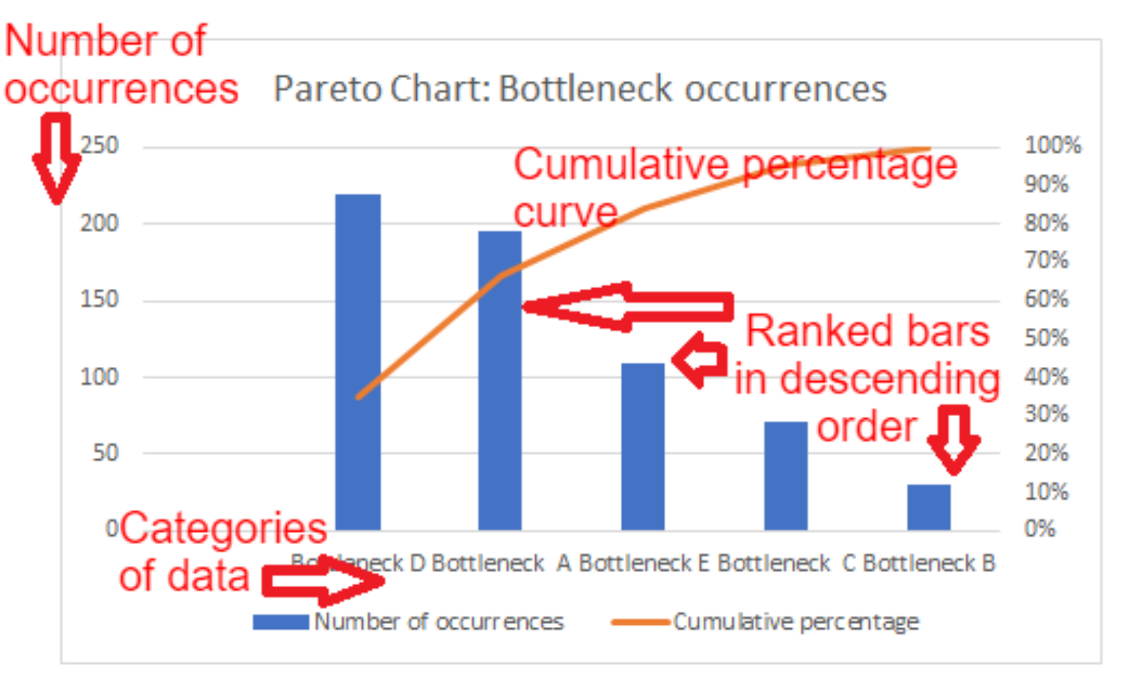
A Pareto chart is a type of bar chart combined with a line graph. It displays the relative frequency or significance of problems or factors in descending order, with the bars representing individual values (e.g., issues or defects) and the line graph showing the cumulative total. The principle behind the chart is based on the Pareto principle (80/20 rule), which suggests that 80% of problems are often caused by 20% of the causes. It helps in identifying the most significant factors that need attention to achieve improvement efficiently.
In the digital support services sector, particularly within IT, Pareto charts are commonly used to identify and prioritise issues in systems, applications, or processes. They help organisations focus on the most impactful problems, improving response times and customer satisfaction by addressing the major pain points.
Example 1: Amazon Web Services (AWS)
AWS uses Pareto charts to identify common causes of service disruptions or support tickets. By analysing data from their support system, AWS can determine which types of incidents are most frequent and impactful. For instance, 80% of all support tickets might be traced back to a handful of misconfigurations or recurring errors in their services. By addressing these high-frequency issues, AWS can improve their platform’s reliability and reduce the volume of incoming support requests.
Why they use it: AWS benefits from Pareto charts as they allow them to pinpoint major operational issues and focus resources on solving the most critical problems, improving the overall user experience and reducing operational costs.
Example 2: Google Cloud
Google Cloud applies Pareto charts in analysing downtime reports and customer feedback related to their cloud infrastructure services. A Pareto analysis helps them quickly see which factors (e.g., network outages, storage failures) are causing the most significant disruptions. By concentrating their efforts on resolving the top 20% of root causes, Google Cloud can greatly reduce system downtime and improve the resilience of their services.
Why they use it: By using Pareto charts, Google Cloud can effectively prioritise their engineering efforts on the key issues affecting customer experience, helping them optimise service performance and reduce maintenance costs.
Activity: Identifying and Solving Common IT Issues Using a Pareto Chart
Objective:
Students will work in small groups to identify common IT support issues within a fictional company and use a Pareto chart to prioritise them. They will learn how to apply the Pareto principle (80/20 rule) in problem-solving and improve their understanding of how this can be used in real-life digital support services.
Materials Needed:
• Flipchart paper or whiteboard
• Markers
• Printed handouts with a list of common IT issues (or displayed on screen)
• A blank Pareto chart template (can be on paper or digitally)
Time: 25 minutes
Instructions:
Step 1: Introduction to the Problem (5 minutes)
• Briefly explain the Pareto principle and how a Pareto chart works.
• Introduce the scenario: The group is working as part of the IT support team for a small company. Over the past month, several technical issues have been recorded by the support team.
• Show them a list of the common IT issues the company is facing (example list below):
• Network outages
• Software crashes
• Email access problems
• Slow internet speed
• Printer malfunctions
• Password reset requests
• Hardware malfunctions
Step 2: Group Discussion (5 minutes)
• In groups of 2-3, students should discuss the list of IT issues. They should use their knowledge to think about which of these problems might occur most frequently and which are likely to have the biggest impact on the company’s operations.
Step 3: Prioritisation and Creation of a Pareto Chart (10 minutes)
• Each group should select the top 5 issues they believe would cause 80% of the problems in the company.
• Using the blank Pareto chart template, they should rank the issues from most frequent to least frequent, drawing bars to represent each issue’s frequency.
• They should also create the cumulative line to show how solving the top issues will address the majority of the problems.
Step 4: Group Presentation (5 minutes)
• Each group will briefly present their chart and explain their reasoning behind the prioritisation of issues. They should discuss how focusing on the top problems can help reduce overall downtime and improve service for the company.
Example for Student Understanding:
Scenario:
In your fictional company, after analysing the data, you find that password reset requests are the most frequent issue, followed by slow internet speed, network outages, printer malfunctions, and email access problems.
Using the Pareto chart, the group can show that password reset requests and slow internet speed make up the bulk of the problems (say, 60%). By addressing these two key issues, they can reduce the number of support tickets significantly and improve the company’s efficiency.
Chart Example:
• Password reset requests (40%)
• Slow internet speed (20%)
• Network outages (15%)
• Printer malfunctions (15%)
• Email access problems (10%)
Outcome:
By the end of the activity, students will have a clear understanding of how to prioritise issues using the Pareto chart, and they will understand its practical application in IT support services.

Scatter diagram
A scatter diagram (also known as a scatter plot) is a type of graph that helps to identify if there is a relationship between two different factors, also called variables. It plots individual data points on a graph, with one variable along the x-axis (horizontal) and the other along the y-axis (vertical). Each dot on the graph represents one instance or observation of the data, showing where the two variables intersect.
How Scatter Diagrams Help Identify Relationships
In digital support services, scatter diagrams are useful for identifying patterns between different aspects of service quality, customer satisfaction, or system performance. By plotting the data, you can visually see whether there’s a relationship, or correlation, between the two variables.
There are three main types of relationships you might observe:
1. Positive correlation: As one variable increases, the other also increases (e.g. the more time a customer spends on a website, the more they are likely to purchase).
2. Negative correlation: As one variable increases, the other decreases (e.g. as response time for customer queries decreases, customer satisfaction increases).
3. No correlation: The two variables don’t seem to affect each other at all (e.g. response time might have no clear effect on sales in some cases).
Example in Digital Support Services
Consider a digital support services company that wants to understand how response time affects customer satisfaction. They could gather data from customer service logs (response time) and customer feedback scores (satisfaction ratings). By plotting response time on the x-axis and satisfaction scores on the y-axis, they could create a scatter diagram to see if there’s any visible relationship. If the points trend upwards, it would suggest a positive relationship—quicker response times lead to higher satisfaction.
Case Study Examples
![]() 1. Amazon
1. Amazon
As a company focused on customer satisfaction, Amazon could use scatter diagrams to assess how the speed of responses from customer service representatives affects overall customer satisfaction scores. By plotting the response time (x-axis) and customer ratings from surveys (y-axis), they could easily see whether faster responses lead to better reviews, helping them to improve their services.
![]() 2. Zendesk
2. Zendesk
Zendesk, a customer service software company, might use scatter diagrams to assess system performance metrics. For example, they could examine whether the number of support tickets open (x-axis) impacts average resolution time (y-axis). If they spot a positive correlation, it could signal that too many open tickets slow down resolution times, which would require action to streamline processes.

3. Netflix
Netflix may use scatter diagrams to track how app performance (like load times) influences user engagement. For instance, by plotting app load time (x-axis) against viewing hours (y-axis), they might see whether faster load times lead to more content being watched, which would help them optimise their app to reduce buffering times and boost user satisfaction.
Investigating the Relationship Between Response Time and Customer Satisfaction
Objective:
You will use a scatter diagram to explore the relationship between customer support response time and customer satisfaction ratings, simulating a real-world scenario in the digital support services sector.
Time: 30 minutes
Instructions:
Scenario:
You are working for a digital support services company that wants to assess how quickly customers receive responses to their queries and how that affects their satisfaction. Your task is to create a scatter diagram to visually explore if there’s any correlation between response time (in hours) and customer satisfaction (rating out of 10).
Step-by-Step Guide:
1. Data Collection (10 minutes)
Below is a set of fictional data showing response times (in hours) and customer satisfaction ratings (out of 10). Use this data to complete the activity:
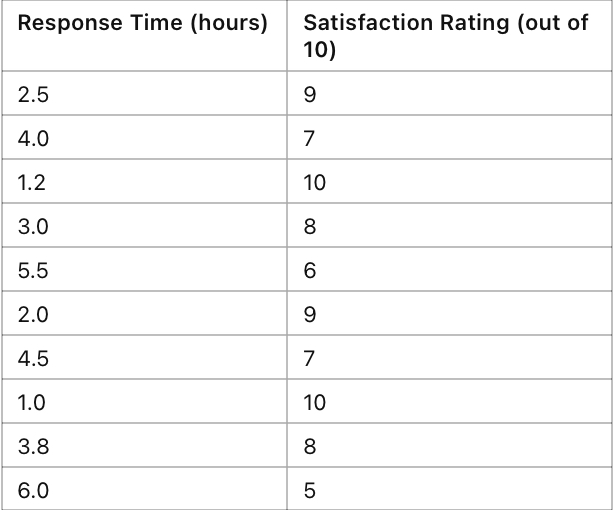
2. Plotting the Data (10 minutes)
Using either graphing software (Excel, Google Sheets) or graph paper:
• Plot Response Time on the x-axis (horizontal).
• Plot Satisfaction Rating on the y-axis (vertical).
• Mark each data point with a dot on the graph where the x and y values intersect.
3. Analysis (10 minutes)
Answer the following questions based on your scatter diagram:
• Is there a clear pattern? Do you see a positive or negative trend, or is there no clear relationship between response time and customer satisfaction?
• Describe the trend (if any). Does customer satisfaction decrease as response time increases?
• Identify any outliers (points that don’t fit the pattern). What might be the reason for these outliers in real-world scenarios (e.g., a particularly complicated customer issue)?
4. Generate Evidence:
• Take a screenshot or photo of your scatter diagram (if using software or graph paper).
• Write a short paragraph (3-5 sentences) describing the relationship between the two variables (response time and satisfaction), supported by what you observed from your diagram.
Deliverables:
• A scatter diagram (either digital or hand-drawn).
• A paragraph describing the relationship between response time and customer satisfaction, based on your graph.
Extension (optional, if time allows)
If you finish early, consider what actions a company might take based on the results. How could they reduce response times to improve customer satisfaction?
Materials Needed:
• Laptop or tablet with access to Excel/Google Sheets (or graph paper and a pencil)
• Data provided above for plotting
Last Updated
2024-10-15 13:32:44
English and Maths
English
Maths
Stretch and Challenge
Stretch and Challenge
- Fast to implement
- Accessible by default
- No dependencies
Homework
Homework
Equality and Diversity Calendar
How to's
How 2's Coverage
Links to Learning Outcomes |
Links to Assessment criteria |
|
|---|---|---|
Files that support this week
Week 2→
Next 2Week 3→
Next 3Week 4→
Next 4←
Prev2