Top
Week 9
3.9 Data visualisation
3.9.1 Know and understand data visualisation formats and when they are used:
Data visualisation formats are used whenever organisations need to transform raw, often complex, data into something that people can quickly understand and act upon. In IT and digital-support settings, staff regularly monitor performance dashboards, network activity logs, help-desk metrics, security alerts, and customer-service statistics. Without visualisation, this information would be harder to interpret, meaning issues could be missed or decisions could be delayed. Visual formats such as charts, graphs, maps, dashboards, or infographics help highlight patterns, compare categories, show changes over time, and reveal anomalies that might indicate risks or opportunities. Good visualisation reduces cognitive load, increases clarity, and supports better communication between technical and non-technical audiences.
Graphs
Charts
Tables
Reports
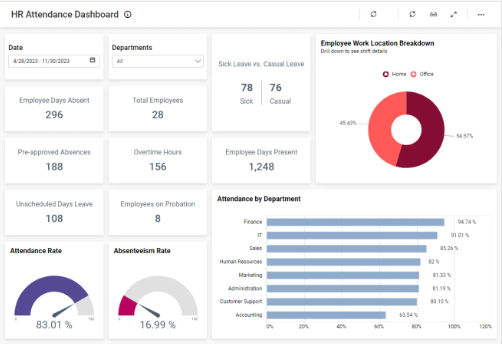
Dashboards
Dashboards in digital support and cyber security are centralised interfaces that display live or near-real-time information using charts, graphs, alerts, and status indicators. They take data from monitoring tools, logs, help-desk systems, and network devices and present it in a clear visual format so that support teams can make quick decisions.
Dashboards are used because digital environments generate huge amounts of data network traffic, CPU usage, login attempts, patch updates, ticket workloads, security alerts, and more. Without dashboards, this data would be difficult to read and patterns might be missed. A well-designed dashboard helps technicians identify problems faster, monitor the health of systems, detect anomalies, and report information clearly to both technical and non-technical stakeholders.
Examples of dashboards might include
Network Monitoring Dashboard
Used for: Tracking the health and performance of network devices.
Typical visuals:
-
Line graphs showing bandwidth usage
-
Alerts for high latency or packet loss
-
Device status (up/down)
-
Heat maps showing Wi-Fi signal strength
Why it’s useful:
Helps digital support teams quickly spot bottlenecks, outages, or unusual spikes in traffic (which may indicate DoS attacks).
Software examples:
-
Nagios XI
-
Paessler PRTG Network Monitor
-
SolarWinds Network Performance Monitor
Security Information & Event Management (SIEM) Dashboard
Used for: Analysing security logs and detecting threats.
Typical visuals:
-
Failed login attempts
-
Malware alerts
-
Unusual IP addresses flagged
-
Correlation graphs showing attack patterns
Why it’s useful:
Helps security teams detect intrusions, monitor suspicious behaviour, and respond to incidents quickly.
Software examples:
-
Splunk Enterprise Security
-
Microsoft Sentinel
-
Elastic Security (ELK Stack)
Help-Desk / Ticket Management Dashboard
Used for: Tracking customer or staff support requests.
Typical visuals:
-
Number of open tickets
-
Average resolution time
-
Tickets by category (hardware, software, permissions)
-
Technician workload distribution
Why it’s useful:
Shows support team performance, identifies backlogs, and helps managers allocate resources.
Software examples:
-
FreshService
-
Jira Service Management
-
Zendesk Support
Cyber Awareness & Compliance Dashboard
Used for: Summarising training, compliance, and risk status.
Typical visuals:
-
Staff who completed security training
-
Phishing test success/failure rates
-
GDPR data-handling compliance
-
Risk register status
Why it’s useful:
Helps managers track organisational progress toward security goals.
Software examples:
-
KnowBe4 Security Awareness Training
-
MetaCompliance
Infographics.
Infographics are visual communication tools that combine images, icons, diagrams, and short text to present technical information in a way that is simple and easy for a wide audience to understand. They are especially useful in digital support and security because many stakeholders—such as staff, customers, senior management, or non-technical users may not understand complex terminology or data from logs, reports, or monitoring tools. Infographics translate these complex ideas into visually engaging summaries, helping people quickly understand risks, trends, instructions, or best practices.
In organisations, infographics are used to raise awareness, educate users, and support safe digital behaviour. They are also used by technical teams to communicate findings, report security incidents, or summarise guidance from frameworks such as Cyber Essentials, GDPR, or internal network policies.
“Choose the Best Visualisation”
Scenario
You have joined the Digital Support team for a medium-sized organisation. Your line manager has given you four sets of data that need to be presented to different stakeholders (technical and non-technical). Your job is to choose the most suitable data visualisation format for each dataset and justify your choice.
Instructions ;
1. Read each dataset description below.
2. Choose ONE visualisation format from the list (charts, tables, reports, dashboard, infographic).
3. Explain in 2–3 sentences why your chosen format is the best tool for that dataset.
4. Share your answers with someone next to you and compare your choices.
5. Be prepared to explain your decision to the class.
Dataset A – Support Tickets
You have weekly data showing how many support tickets were raised in five different departments.
Task: Which visualisation format best shows comparisons between departments?
Dataset B – Network Traffic
You have minute-by-minute network usage data collected over 24 hours.
Task: Which visualisation shows fluctuations and patterns over time?
Dataset C – Log-In Failures
You have a table showing the number of failed log-ins per hour across different rooms in the building.
Task: Which visualisation helps identify patterns or hotspot areas?
Dataset D – Cyber-Attack Locations
You have locations of attempted cyber-attacks from around the world over the last month.
Task: Which visualisation helps show data by region or country?
3.9.2 Know and understand the benefits and drawbacks of data visualisation formats based on:
Data visualisation formats such as charts, graphs, dashboards, network diagrams, and infographics are vital tools for turning raw data into meaningful information. They allow patterns, trends, risks, and relationships to be understood at a glance. This is especially important in digital support and security, where teams monitor system metrics, identify incidents, and communicate technical information to stakeholders.
However, even though visualisation can make data clearer, it also brings limitations and potential risks. Poorly chosen visual formats can mislead users, oversimplify complex issues, or hide important details. In security settings, a misunderstanding caused by a flawed visualisation may lead to incorrect decisions, delayed incident response, or miscommunication between technical and non-technical staff. Let's look at some of these areas below.
Type of data
This relates to what information is being visualised and how suitable each format is for that data.
Benefits
-
Different visual formats are ideal for specific data types:
-
Line graphs → excellent for time-series data (e.g., bandwidth over 24 hours).
-
Bar charts → ideal for categorical data (e.g., number of support tickets per department).
-
Heat maps → effective for frequency/volume intensity data (e.g., hotspots of failed logins).
-
Scatter plots → good for correlation data (e.g., CPU load vs. temperature on a server).
-
Drawbacks
-
Choosing the wrong visualisation makes the data harder to interpret.
-
A pie chart does not work for time-series security events.
-
A line graph is misleading for purely categorical data.
-
-
Some data types (e.g. logs, raw IP-based attacks) may require context that visuals alone cannot show.
Example
A technician tries to show DDoS attack frequency with a pie chart—this misrepresents the data because the attack occurs over time, not as categories.
Intended audience
This refers to who the visualisation is designed for and how their level of digital understanding affects its effectiveness.
Benefits
-
Visualisations make technical information accessible for non-technical audiences:
-
Infographics can explain phishing risks to general staff.
-
Executive dashboards simplify metrics for senior managers.
-
-
Technical audiences benefit from more detailed visuals:
-
Security analysts use SIEM dashboards with multiple graphs, raw events, and filters.
-
Drawbacks
-
Oversimplified visuals can hide critical detail from technical staff.
-
Highly technical dashboards can overwhelm non-technical users.
-
Visual choices must match the user’s skill level to avoid misunderstanding.
Example
A colourful infographic summarising malware alerts works great for general staff training, but a SOC analyst needs the raw logs, timestamps, and attack vectors—not just a simplified visual.
Brief.
This refers to why the visualisation is being created—its goal, the message it must convey, or the decision it must support.
Benefits
-
A well-written brief ensures the most effective format is chosen.
-
A network status dashboard supports real-time decision-making.
-
A monthly help-desk performance report supports service improvement.
-
A cyber-risk infographic supports organisational awareness.
-
Drawbacks
-
A vague or unclear brief leads to poor visual design choices.
-
If the brief doesn’t specify audience, data type, or required outcome, visuals may be:
-
too detailed
-
too simplistic
-
or incorrectly focused
-
Example
If the brief is “show the security posture of the organisation,” a single chart is insufficient; a multi-component dashboard showing device compliance, patch levels, endpoint alerts, and login anomalies would be needed.
Last Updated
2025-12-01 10:10:15
English and Maths
English
Maths
Stretch and Challenge
Stretch and Challenge
Homework
Homework
Equality and Diversity Calendar
How to's
How to's Coverage
Links to Learning Outcomes |
Links to Assessment Criteria |
|
|---|---|---|
Files that support this week
→
Next ←
Prev