| Week 1 | T&L Activities: Unit in brief Learners investigate website development principles. They will design and develop a website using scripting languages. Unit introduction Increasingly, organisations rely on websites to serve customers and, in some cases, to generate revenue. With millions of web pages being created daily, the need for websites to be engaging, innovative and desirable is important. As a website developer, you must use sophisticated techniques to capture user interest and to ensure that customers are served. The scripting involved in the development of websites has become crucial: website developers need to understand and acquire the necessary skills to find solutions to a variety of scenarios and problems. In this unit, you will review existing websites – commenting on their overall design and effectiveness. You will use scripting languages such as Hypertext Markup Language (HTML), Cascading Style Sheets (CSS) and JavaScript® and a simple text editor, or rapid application development tools. Finally, you will reflect on the website design and functionality using a testing and review process. Many software developers, database experts and systems managers need web-client development skills as an integral part of their overall portfolio of expertise. This unit will prepare you for employment as a website developer or as a website development apprenticeship. The unit will benefit you if you want to go on to higher education to develop your studies. Learning aims In this unit you will: A Understand the principles of website development B Design a website to meet client requirements C Develop a website to meet client requirements.
Files that support this week
| English:
|
Assessment:
Traffic Lights - Learners use green, amber and red traffic lights to indicate levels of understanding and to attract support from peers and the teacher. One-Minute Verbal Assessment - The teacher asks learners to prepare and deliver a one minute verbal summary of a forthcoming or completed activity, session or topic. |
Learning Outcomes:
|
Awarding Organisation Criteria:
|
||||||||||||||||||||||||||||||||||||||||||||||
| Maths:
|
|||||||||||||||||||||||||||||||||||||||||||||||||||
| Stretch and Challenge:
|
E&D / BV | ||||||||||||||||||||||||||||||||||||||||||||||||||
| Homework / Extension:
|
ILT | ||||||||||||||||||||||||||||||||||||||||||||||||||
| → | → | → | → | → | → | ||||||||||||||||||||||||||||||||||||||||||||||
| Week 2 | T&L Activities:Purpose of websites, including the features of:content-based (Web 2.0 technologies)“What do you know about web 2.0 technology?” The first shopping cart applications, which most e-commerce website owners use in some shape or form, basically fall under the category of Web 1.0. The overall goal was to present products to potential customers, much as a catalogue or a brochure does — only through website retailers could also provide a method for anyone (anywhere in the world) to purchase (their) products. The Web 2.0 appears to be a welcome response to web users demand to be more involved in what information is available to them. This era empowered the common user with a few new concepts like Blogs, Social-Media & Video-Streaming. Publishing your content is only a few clicks away! Few remarkable developments of Web 2.0 are Twitter, YouTube, EzineArticles, Flickr and Facebook. Web 3.0 is said to have more. Using a word document create some research to what web 3.0 is supposed to be about and have.
Are we there yet??
The Next Big Thing is Web 3.0. Catch It If You Can from Judy O'Connell
The dawn of the internetproduct and/or service-basedWebsites can fall into a range of different categories.
target audience, e.g. social networker, seekers, gamers, buyers, age profile, genderThe target audience of a website can have a huge effect on how the websites will be designed and developed. Websites often follow trends on how they present themselves based on their target audiences, for example, a number of large gaming websites tend to use dark backgrounds with lighter text on them. Social media websites tend to use lighter colours with darker text. Children's websites tend to have vibrant colours that appealed to younger audiences. These considerations must be taken into account when designing any website, taking some understanding/research into the target demographic. Other factors that should be looked at things like age groupings and gender. These areas can influence and impact users and the success of a website if rushed or ill-considered. What's a target audience and who are you designing for anyway? requirements, e.g. user-friendly, consistent, navigational, customisable, flexible.User-friendly - Is the site able to allow users to move around it easily? When a site is user-friendly it makes for a positive experience and could have the potential to make the visitor want to return to it. By making the site clear to the users they will be able to make purchases or find information quickly and efficiently. Consistent - Websites can be made up of a number of web pages that provide services, information, and potential downloadable products that users may want, however, if a site consists of random designs, layouts, and terminology on each of its pages users may get the impression that they have navigated away from the original site. Navigational - Consistent navigation on a website is one of the key areas to a successful site if a user is able to move around the website freely and simply. Location of navigation can be customised, however, this should be to one of two places as this has become a non-agreed standard, these being, top of the page or down the left-hand side of the screen (language depending, as some country's read text right to left). Customisable - With the progress and advances in web development technologies, websites have the ability to manipulated to enable the customisation of the layout and features within it. Sites like Facebook and Twitter have used this feature to keep their users engaged and returning to the site. Flexible - Or otherwise known as responsive websites are adaptive to your device that you are viewing them through. This is not common on all sites, however for the most major sites it is a key requirement. To enable this responsivity we use a tool within HTML and CSS called Media Queries and Viewports, these are lines of code that will review the size of the window that is being used to look at the website and then presents the stylesheets that add the presentation theme to the information on the site. Bandwith - Users to a site will be using their internet connection to access it, developers and designers of websites need to consider this as a potential issue. This could be that the site uses a high number of images, these images could be high in quality so therefore large in file size, then in turn will affect the speed in which it is downloaded to the users computer (bandwidth speeds can depend on traffic on a connection and or the contract an individual holds with their supplier).
Create an information booklet that provides examples and explanations to the audience categorisations that are currently classified. Files that support this week | English:
Phrase: a group of words, smaller than a clause, which forms a grammatical unit Point of view: a term from literary studies which describes the perspective or source of a piece of writing |
Assessment:
Comments to Independent Work - Teachers write feedback on strips of paper. In groups, learners have to work out which feedback is theirs. Learners will create powerpoint and word documents that discuss web technologies and their developments based on compiled research that they have evaluated. Peer assessments and verbal feedback Just a Minute - At the end of the lesson teachers ask learners to summarise their learning. The comparison of these summaries against learning objectives informs planning. |
Learning Outcomes:
A.P1 Compare the principles of website design used in two websites, including their suitability for the intended audience and intended purpose. A.M1 Analyse how the principles of website design are used to produce creative, high-performance websites that meet client requirements. A.D1 Evaluate how the principles of website design are used to produce creative, high-performance websites that meet client requirements |
Awarding Organisation Criteria:
A.P1 Compare the principles of website design used in two websites, including their suitability for the intended audience and intended purpose. A.M1 Analyse how the principles of website design are used to produce creative, high-performance websites that meet client requirements. A.D1 Evaluate how the principles of website design are used to produce creative, high-performance websites that meet client requirements Learning aim A: Understand the principles of website development |
||||||||||||||||||||||||||||||||||||||||||||||
| Maths:
Statistic extracting information: Tables, Diagrams, Charts and Graphs |
|||||||||||||||||||||||||||||||||||||||||||||||||||
| Stretch and Challenge:
|
E&D / BV | ||||||||||||||||||||||||||||||||||||||||||||||||||
| Homework / Extension:
|
ILT | ||||||||||||||||||||||||||||||||||||||||||||||||||
| → | → | → | → | → | → | ||||||||||||||||||||||||||||||||||||||||||||||
| Week 3 | T&L Activities:Principles of website designAssignment 1 Out Key Principles Of Good Website Usability1. Availability and AccessibilityLet’s start with a basic, yet central aspect of usability: the availability and accessibility of your site. If people try to access your website and it doesn’t work — for whatever reason –your website becomes worthless. Here are a few of the basics of availability and accessibility,
2. ClarityYou could say the core of usability is clarity. If you distract or confuse your visitors, they will either need more time to find what they came for, or they might forget their initial goal altogether. Either way, they will not experience your website as user-friendly and chances are that they leave dissatisfied and with no intention of coming back. Visitors come to your site with certain goals in mind. It is your job to help them reach these goals as quickly as possible. If you can manage to do that, your visitors will be pleased and you have laid the groundwork for a positive experience. A clear and usable design can be achieved through:
3. LearnabilityLearnability is another important aspect of usability. It should be your goal to design intuitive interfaces — interfaces that don’t require instructions, or even a long process of trial and error to figure them out. Key to intuitive design is to make use of what people already know, or create something new that is easy to learn. By now, people are familiar with a lot of design concepts used on the web. By using these concepts consistently, you meet your visitors’ expectations. This way, you help them reach their goals more quickly. As human beings, we like patterns and recognition, which is why we are better at handling familiar situations rather than unfamiliar ones. If you use new concepts in your design, make sure to use them consistently and give people a hand during the initial learning phase. For example, you can offer additional information, or instructions the first time they use your site or product. Keep it simple and visual to help people remember new concepts.
4. CredibilityCredibility is a crucial aspect of any website. Even if people find the content they are looking for, if they don’t trust you, that content is worthless. Your website could cause site visitors to be sceptical about your business in any number of ways including whether or not you really exist, your reputation, or the quality of your content. It is important that people know you are a real company with real people. Offer a clear “About Us” page together with your contact details and if possible a physical address. Of course, your content also plays an important role in the perceived trustworthiness of your site. Make sure you are honest and precise about your content. Avoid mistakes, such as incorrect grammar or misspellings. Don’t be modest about your expertise. If you are an expert in your field, make sure people know it. For example, you can show third-party testimonials, work references, or the number of your social media followers to win your visitors over. 5. RelevancyLast but not least, relevance contributes to good website usability. It is not enough that your website is clear, your content must also be relevant. Again, it is essential that you know your users and why they visit your site. Start with defining who your users are. Second, talk to them to find out what their goals are when visiting your site. Third, define user scenarios that demonstrate in which situation people visit your site to find what kind of content. Any design decision that you make should result in a more user-friendly website for your users. whitespace - A common issue in design and implementation of web pages and sites, site layout, Read the following article on Paul Boag's blog where he argues his points in relation to Whitespace as a positive, Identify at least 5 points of interest from within his blog that you can use in your assessment discussions later.Pauls blog link Sites that have ill-considered layouts that have the potential to confuse!
The list above are but a few of poorly considered sites, Using the list above identify what you find to be poor about the whitespace within them, you should use screenshots to support your explanations.
Principles of Accessibility
Provide appropriate alternative text
SpacingSpacing on a website will enable content to present itself clearly. The use of space on any website should be carefully considered as this may lead users to expect something to appear or assume that something is missing. When done correctly, certian spacing may lead to an aesthetically pleasing site that makes the user experience a pleasurable one. A good case study to use is Google, their site has worked efficiently due to its clear design, this meant that users didn't get bogged down with "noise" content that was not of interest. Use google and other search engines and evaluate them for their efficiency, design and functionality. NavigationA navigation bar on any site needs to ensure that users get to the location that is presented, however, it needs to be clear that the navigation bar is, actually the navigation bar and not a list or set of images that make assumptions on user knowledge. In most cases navigation bars are located in the left-hand side of the screen or at the top, however, this may be different to Arabic users that present text that reads in the opposite direction to most western languages. Typography
Create your own font, using the following link Create your own font fill in the document like the example below and then follow the instructions as per the site.
Typography enhances the readability of information on a web page, yet — quite ironically — it also helps users avoid reading. This is the true and "most humane purpose" of design. Mind blown? Smashing Magazine Covers principles Typography alignment,There are many sites that push the envelope of normal alignment, in most sites content and elements are contained within the center of the page, this can be challenged with the use of websites that adopt technologies such as "Parallax" these can be located all around the page and can move the user right to left and up and down. Find 5 parallax websites that you think are the best. What makes them good?
consistency/intuitivenessThe art of any successful site enables the users to move around it without questioning "how do I get to a point in the site"? "where am I!" and more importantly "why am I here"! Consistency throughout a site will allow the users to feel like they are still in/on your site and haven't been navigated away to some spam site that is making money out of you or opening up your computer to all kinds of nasty's. accuracyTo achieve a successful website, developers, and owners, need to ensure that the content found on the site are accurate. This links to things like spelling and grammar, to regularly updated content on the site. The issue of updating content on a regular basis is of paramount importance, these updates and changes will provide opportunities for the site to move up through internet search engines.
contentContent on the site needs to offer variety to ensure that visitors are engaged and interested. This also requires the content to be considered for its relevance and importance to the page areas that it exists on. Any content that is used and referred to should comply with any legislation and legal constraints. mediaUsing the correct type of media is key to a successful website, carefully chosen assets compliment content and enhance the site. However user experience must be considered at all time, visitors to the site may use equipment that not be able to fully realise the experience. Key factors such as internet speed, client and server hardware and most importantly the file types and sizes used.
The development of a website requires the developer to deal with a number of considerations when dealing with their client. User experience, User access and client demands. SimplicitySimplicity is an art within web design, there are many principles that developers can adopt. One such key principle is the Occums Rasor methodology. This principle refers to the saying, less is more. The principle of Occam's razor is attributed to William of Ockham (c. 1285 - 1348), an English theologian, logician, and Franciscan friar. The element of keeping the content and layout of the site to a simple level removes confusion and misunderstanding that can happen. A classic example of this principle in action is Google landing page.
Golden RatioOther principles that should be considered is the golden ratio, this is proven to be naturally occurring in almost everything in our world and relates to beauty. The below animation provides some detail on its implementation and presence.
Research into the golden ratio, find out its numerical value. Provide examples where this has been applied. Research the Alexa Traffic Rank service. How does this service rank pages?
Files that support this week | English:
|
Assessment:
Negotiated Learning Goals - The teacher displays an exemplary piece of work and works with learners to agree what needs to be done in order to achieve such a high standard. Learners will create materials that reflect, analyse and evaluate websites of poor design and provide them opportunities to criticise choices made. Peer assessments and verbal feedback Peer Assessment of Independent Work - Learners work in groups to assess each other |
Learning Outcomes:
A.P1 Compare the principles of website design used in two websites, including their suitability for the intended audience and intended purpose. A.M1 Analyse how the principles of website design are used to produce creative, high-performance websites that meet client requirements. A.D1 Evaluate how the principles of website design are used to produce creative, high-performance websites that meet client requirements |
Awarding Organisation Criteria:
A.P1 Compare the principles of website design used in two websites, including their suitability for the intended audience and intended purpose. A.M1 Analyse how the principles of website design are used to produce creative, high-performance websites that meet client requirements. A.D1 Evaluate how the principles of website design are used to produce creative, high-performance websites that meet client requirements |
||||||||||||||||||||||||||||||||||||||||||||||
| Maths:
Time: Reading clocks and calendars, using timetables, organising appointments, conversions, dates Using numbers: Written or mental methods, using a calculator, rounding and estimating, problem solving |
|||||||||||||||||||||||||||||||||||||||||||||||||||
| Stretch and Challenge:
|
E&D / BV | ||||||||||||||||||||||||||||||||||||||||||||||||||
| Homework / Extension:
|
ILT | ||||||||||||||||||||||||||||||||||||||||||||||||||
| → | → | → | → | → | → | ||||||||||||||||||||||||||||||||||||||||||||||
| Week 4 | T&L Activities:Media and objects, e.g. position, colour, contrast, size, appropriateness.Media and objects within web development provide web developers and website owners the ability to include a wide range of services that can make a web page more interactive or interesting. The ability to add things like PDF viewers on a page for others to read documents, the use of flash players to enable interactive elements like games and quizzes (However flash has now been announced by Adobe as being dropped as a product). Media that can also be used on web pages are videos and audio as well as images. Position - on any website the position and placement of objects on a page are important to capture the attention of clients and visitors. The prominence of an image could promote a service or product better than one that has text and a small image located off the screen when it loads. Colour - Colour is important and must reflect a companies image. The use of colour on a website can set the mood of a site. The use of applets/flash players and external content can have animations and content that uses colour, this should be evaluated against the websites colour scheme additional to the users experience as these colour could distract/deter users from staying or visiting the site. Other issues relating to colour could be users that have photosensitivity. Colour also has its limitations such as, colour blindness - Common amongst most males, statistically 1:4 suffer from one of 3 different types of blindness. Size - The use of media on a website may require elements to be set to a large size and location on the page, however, this size could/can overshadow the content that is not media and the result would be that users would need to scroll to see it, also, if users are using mobile devices there experiences could be affected. Appropriateness - Most clients of website developers will require content that is fantastically dynamic and interactive, but, is the content needed/required? The appropriateness of the content must be looked at from the point of function and performance over feature. The inclusion of high-end features and media may have a negative effect on the performance of the website. This is due to the loading of additional plugin's tools and players, of which some may not function on some mobile devices, for instance, flash on Apple devices.
Review 3 sites that have media and objects on them, look at them for compatibility on all devices and their function over there feature.
Creativity and innovation, e.g. unconventional layouts, white space, ‘outside of the box’ thinking, golden ratio. Creativity and imagination can lead to a successful project, web developers and development companies may often scrap a design at a final development stage as another solution or layout has become a prefered option. Evolution of a site is natural, this site it's self-has had a number of versions prior to this and undoubtedly it will evolve again in the not too distant future.
Good design is not decoration. Good design is problem-solving. - Jeffrey Veen There are a number of design principles that should be considered when designing a website such as the following;
The Golden Ratio - This principle has been around for century's a Greek sculptor and mathematician Phidias (500 BC - 432 BC) , studied phi and applied it to the design of sculptures for the Parthenon. Euclid proved that the diagonals of the regular pentagon cut each other in "extreme and mean ratio", now more commonly known as the golden ratio. Apple has also adopted the golden ratio in their designs too, the iconic iPod adopts it in its screen and dial.
Occums Rasor
The razor's statement that "other things being equal, simpler explanations are generally better than more complex ones" is experienced throughout it's testing. One justification of Occam's razor is a direct result of basic probability theory. By definition, all assumptions introduce possibilities for error, if an assumption does not improve the accuracy of a theory, its only effect is to increase the probability that the overall theory is wrong. “Design is the method of putting form and content together.” Paul Rand Consider the following
Hicks Law - RT = a + b log2 (n)
Hick’s Law is in application almost everywhere, not just in web or app design. A design principle is known as “K.I.S.S.” (“Keep It Short and Simple”) became recognized in the 1960s for its effectiveness. Hick’s Law, K.I.S.S. suggests that simplicity is the key to success. First adopted by the U.S. Navy, the principle of “K.I.S.S.” was in used in many industries by the 1970s. In some instances, K.I.S.S. gets translated as “Keep It Simple Stupid”.
Good design and consideration of Hick's law can be seen in Google's designs over a number of years. The below images show the development and changes that the site has gone through. 2006
2008
2009
2010
2011
2012
2013
2018
Using the following link and resources https://www.interaction-design.org/literature/article/hick-s-law-making-the-choice-easier-for-users Create a simple powerpoint presentation of no more than 8 slides on the principles of Hicks Law and Occums Razor.
Some further reading on design principles linked to Hicks Law and Occums razor can be found within Universal Principles of Design
Search engine optimisationHaving a successful website requires a number of key design and development factors to work together. These factors will play a big part in the ranking and positioning of the website on a search engine. This consideration can lead to more users seeing the site and therefore making it potentially profitable for the owners. The term SEO or search engine optimisation deals with how the site is optimised for search and user accessibility and usability alongside how old the content on the site is. Developers can use a number of techniques to ensure that they meet a number of the core requirements to give their sites a chance of being rated highly in search engines.
Meta TaggingMeta tags are used in all websites to give users and web crawling bots key information about the webpage and site. Normally found at the top of the webpage inside of the head tag, they can have the following information;
In the example above we have defined the character set that is being used in this case UTF-8. UTF stands for Unicode Transformation Format. The '8' means it uses 8-bit blocks to represent a character. KeywordsKeywords within the content of a website are key and important parts of search engine optimisation, they are used to provide single words or phrases that can be used to categorise a website or page. Often in websites, developers will repeat these purposefully in an attempts to get them catalogued by bots and search engines. Classic examples of this in action would be sites that offer "free" things. Most of us at some point or another will look for an item and then put free to hopefully get something for nothing. These words should be considered, however, remembering your key and core point of the website as well as your target audiences.
UpdatesAs mentioned in previous parts of this week, having content that is updated regularly and maintained tend to be seen by spiders and bots as a positive on the website, this would mean that the site is current and looked after, there are a number of sites out on the internet that has not be updated for a decade, the question is, is this information relevant to today? some things may not need changing! consideration is still required to ensure that a site is managed effectively to enable it to be listed high in results pages of search engines. Limiting CrawlingWeb bots and spiders have the ability to crawl over the complete site and all pages of a website to catalogue and update their databases, the use of this as mentioned earlier is great to enable your site to be searched for using a number of different keywords, however, this can if done continuously and at peak times of the day when a site has users/visitor have a negative effect on the loading and performance of the web server and site. Websites are able to limit this feature with the inclusion of some scripting inside a file on their website. The use of a robots.txt file will enable users to determine a number of things, below is an example of a robot.txt file. #Robots.txt for www.sitename.com The crawl delay value of 5 tells the crawler/bot to wait 5 seconds between each request to the server. Most legitimate crawlers and bots will adhere to these instructions, unfortunately, spam bots will not listen to these requests. If you prefer all crawlers stick to this crawl speed limit you can use a wildcard in your user-agent instruction like this: “User-agent: *”, but that will also slow down important crawlers such as Google Bot and Bing Bot.
Files that support this week | English:
Hyphen: a short horizontal mark used to connect words or syllables, or to divide words into parts Idiom: a sequence of words which forms a whole unit of meaning |
Assessment:
Sentence Scramble - Learners unscramble sentences to check and develop their knowledge and understanding of content, punctuation and grammar. Learners will apply investigative research to present understanding and knowledge of design laws and principles supported by appropriate screenshots. Peer assessments and verbal feedback One-Minute Verbal Assessment - The teacher asks learners to prepare and deliver a one minute verbal summary of a forthcoming or completed activity, session or topic. |
Learning Outcomes:
A.P1 Compare the principles of website design used in two websites, including their suitability for the intended audience and intended purpose. A.M1 Analyse how the principles of website design are used to produce creative, high-performance websites that meet client requirements. A.D1 Evaluate how the principles of website design are used to produce creative, high-performance websites that meet client requirements Learners will learn that different disciplines use words differently. Learners will learn to search for keywords in the relevant discipline. |
Awarding Organisation Criteria:
Learning aim A: Understand the principles of website development A.P1 Compare the principles of website design used in two websites, including their suitability for the intended audience and intended purpose. A.M1 Analyse how the principles of website design are used to produce creative, high-performance websites that meet client requirements. A.D1 Evaluate how the principles of website design are used to produce creative, high-performance websites that meet client requirements
|
||||||||||||||||||||||||||||||||||||||||||||||
| Maths:
Fractions: Sharing amounts, Calculating fractions, Comparing fractions Analysis of information: Interpreting Results, Drawing conclusions from data, Comparing data
|
|||||||||||||||||||||||||||||||||||||||||||||||||||
| Stretch and Challenge:
|
E&D / BV | ||||||||||||||||||||||||||||||||||||||||||||||||||
| Homework / Extension:
|
ILT | ||||||||||||||||||||||||||||||||||||||||||||||||||
| → | → | → | → | → | → | ||||||||||||||||||||||||||||||||||||||||||||||
| Week 5 | T&L Activities: Factors affecting website performanceWhere scripts run (on the web server – server-side scripts, or the local client machine – client-side scripts).
Browser compliance, e.g. which elements are supported by different browsers.
As most users are aware there are a number of different web browsers out there that can be used to access the internet and to look at your favourite sites. However, these can operate in slightly different ways. These browsers use compilers that interpret the code that is presented to it and can display the site in different ways.
Using the browsers installed on your computer navigate to a number of different sites and review these against each other for how that they operate and are displayed.
Server-side factors, e.g. bandwidth availability, number of hits, file types. The download speed is the speed in which something can copy data from the internet to a computer system. The type of service you use can all depend on the download speed, here are some services that can be used: Dial-Up- Dial up is an old-fashioned way of computer connection. It uses the current analogue telephone line and it has continued to be a popular way of connecting for years. When it first came out it had the average speed of 56kbps. ISDN- ISDN is formally known as Integrated Service Digital Network. This means that the ISDN is a digital network and it connects in a digital way. It is faster than the dial up at the speed of 128kpbs. It does need to be connected to a digital line for it to work. DSL- DSL is formally known as Digital Subscriber Line, it uses the digital lines to run quicker the difference between ISDN and DSL is the speed and price. ISDN is cheaper than DSL because DSL is faster than ISDN; DSL has a speed of 1mp – 8mph. Broadband-Broadband is the fastest with an expected speed of 100mbps (measured in bits per second) in the near future. It is the newest one and many people have broadband over the others. Broadband is constantly changed and improved to keep the speed up. File types File types have the ability to slow down below palm of any web page. Most web pages will have images and in some cases videos, which if not compressed their sizes may impact the load time. It is down to the developer to make a decision to decide what file type is appropriate to use when creating websites, this decision must take into consideration the balance of compression over quality. The more compressed a file becomes the more quality is lost. Number of Hits This is the number of hits and website takes can have an effect on its performance. This could be a ticket sales website where tickets for an event go live a specific time, this would then mean that the server would have a number of users accessing and one single time. Servers can be set up to protect attack from attempted hackers and viruses, so when a large number of people accessing at one time the server could be tricked into thinking they were under attack.
Client-side factors, e.g. upload and download speeds, browser, cache memory, processor speed, interactivity The following PC performance factors all make a chance to website performance: Upload and Download The upload and download speed of a client's connection can have an effect on overall experience of using a website. Users on old dial-up modems may only achieve slow connections, so when downloading webpages with a large number of images on them, they could take some time to fully load. Browser The way in which a web browser will load the website can vary between browser. As you are aware there are a number of different web browsers available market for you to download and use, such as, Internet Explorer, Firefox, Opera, Safari and some other third-party browsers. Each of these browsers uses what is known as a compiler, these compilers will interpret the HTML code matters presented to them. Each of these browsers dependent on the compiler about using can have minor differences in how they present a website to the user. In some instances where users have not updated their web browsers they may find that there are areas where they are unable to access certain features of a website. As web developers, you may be asked to create a website that is compliant with one or more different browsers. cache memory Cache Memory-Cache Memory this is the memory in which your computer has. The bigger the memory the faster the computer will run. The cache memory is used to reduce the average time to access memory. The more memory you have the less your computer has to deal with the quicker the system can run. My advice to you to keep your computer performance up is to make sure you do a regular disk clean up, defragging and a general clear out at least once a month, but it all depends on how much you use your computer system. A cache memory is a temporary internet file. When you go on to an internet page it gets saved onto your hard drive this makes it easier for the computer to re-access it when you try to access a site. This takes up memory and occasionally will need deleting for space. processor speed
Processor-Processor is the main part of the computer; everything is run by the processor. When purchasing a computer you will see different types of processors and different numbers as such this number are the speed of the processor, an example would be Intel core processor i3 this is a good processor but you can get an i7 which will be faster meaning your computer performance would be excellent compared to the i3. You can have a fast internet connection but you may have a slow processor this would mean that it takes awhile for your internet to load and connect to the pages yet the internet connection is fast. It's deceiving as if you updated your processor your internet would work efficiently. Files that support this week | English:
Syntax: the arrangement of words to show relationships of meaning within a sentence |
Assessment:
Just a Minute - At the end of the lesson teachers ask learners to summarise their learning. The comparison of these summaries against learning objectives informs planning. Question and Answer - Verbal discussion with learners to quantify understanding
Visual Instruction Plan: Content - The teacher works with the class to create a visual summary of what needs to be considered when answering a question or completing a task. So that learners are supported when attempting questions on their own. |
Learning Outcomes:
A.P1 Compare the principles of website design used in two websites, including their suitability for the intended audience and intended purpose. A.M1 Analyse how the principles of website design are used to produce creative, high-performance websites that meet client requirements. A.D1 Evaluate how the principles of website design are used to produce creative, high-performance websites that meet client requirements |
Awarding Organisation Criteria:
A.P1 Compare the principles of website design used in two websites, including their suitability for the intended audience and intended purpose. A.M1 Analyse how the principles of website design are used to produce creative, high-performance websites that meet client requirements. A.D1 Evaluate how the principles of website design are used to produce creative, high-performance websites that meet client requirements |
||||||||||||||||||||||||||||||||||||||||||||||
| Maths:
Analysis of information: Interpreting Results, Drawing conclusions from data, Comparing data |
|||||||||||||||||||||||||||||||||||||||||||||||||||
| Stretch and Challenge:
|
E&D / BV | ||||||||||||||||||||||||||||||||||||||||||||||||||
| Homework / Extension:
|
ILT | ||||||||||||||||||||||||||||||||||||||||||||||||||
| → | → | → | → | → | → | ||||||||||||||||||||||||||||||||||||||||||||||
| Week 6 | T&L Activities:Website designUnderstanding the steps involved in developing a design for a client website.
Problem definition statement requirements:The beginning of any web project requires an understanding of the intended audiences, including a full summary of the problem to be solved any constraints and benefits a nature of interactivity, complexity of the website. As mentioned in previous lessons, it is key to identify to your client that the website is for their clients. This stage of the design and development of a website requires the developer to gain and gather as much detail as is possible. Once gathered and interpreted the developer may produce a report or statement which outlines and demonstrates an understanding of the requirements and early stages to the strategy of addressing the needs. Headings that can be used in the definition statement/report could include;
Purpose requirements as defined in a client brief for their interactive website.Who's the website for? Application of website design principles by professionally created websites. Initial design ideas/prototypes (illustrating design principles) and the requirements for an interactive website, including: diagrammatic illustrations, the age-old expression a picture speaks a thousand words rings true at this point of the design. Users/client and, developers will always have different views/interpretation of a given scenario. This issue is best tackled by the use of storyboards, mood boards, wireframes and sitemaps. Each has the power to enable all linked to the project to be able to understand what visions they have. Storyboards
Create a storyboard of a website that you have recently used, do not show or tell others what your site is and create your storyboard (DO NOT ADD TEXT/LOGO OF THE SITE/COMPANY). Once you have completed it swap with another person in the room and see if they can guess your site without you telling them. Moodboards Moodboards provide further detail to a vision of ideas towards the design of a website. In a mood board, designers can find and stick on to a virtual piece of paper scraps of colour, font, images textures that they would like the site to use/have in its presentation. Companies can attach their logo to the mood board and try and find elements that compliment this as a "corporate brand". The below image demonstrates a mood board for a baby site.
image from, http://netdna.webdesignerdepot.com
Wireframes The below example is a simple wireframe of a webpage, wireframes offer a more structured visualisation of the position and proportions. A step on from the storyboard wireframes can give the final design structure to a client ready for sign-off. Wireframes should be supported with additional information relating to the colours, fonts, styles that are intended to be used on the site. The following wireframe was created using, Edraw
Site-maps An HTML sitemap allows site visitors to easily navigate a website. It is a bulleted outline text version of the site navigation. The anchor text displayed in the outline is linked to the page it references. Site visitors can go to the Sitemap to locate a topic they are unable to find by searching the site or navigating through the site menus. Sitemaps are a way of organizing a website, identifying the URLs and the data under each section. Google's XML sitemap format was designed for the search engines, allowing them to find the data faster and more efficiently. Business websites often contained hundreds of products in their catalogues, while the popularity of blogging led to webmasters updating their material at least once a day, not to mention popular community-building tools like forums and message boards. As websites got bigger and bigger, it was difficult for search engines to keep track of all this material, sometimes "skipping" information as it crawled through these rapidly changing pages. At the initial design, stage sitemaps tend to reflect a hierarchy diagram. These diagrams define the links between the pages and in cases subfolders for additional linked content. To create a sitemap you are able to use sites such as, XML Sitemaps realistic representationsIt is worth remembering when creating a design for a client a number of things.
search engine optimisation What is meant by search engine optimisation? Search engine optimisation is a technique that is used to increase the number of visitors to a website. This is a website developer can ensure that their website is high on the list of results returned by search engine, following a number of simple techniques. A website through effective search engine optimisation can have the ability to present a website services and to a larger audience as this is due to careful consideration relating to keywords and content on the site. As mentioned previously there are a number of simple techniques that a web developer can use to push a websites linking on a search engine higher. 1. The use of Meta tags provides webpages debility to provide data to website spiders that will crawl across a website pages searching for information. Meta tags are usually found within the head tag of any web page. These meta tags can include information such as;
2. The use of keywords on the website should be carefully considered as the frequency in which they appear on the website will and search engine spiders to index your website based on repeating keywords. 3. Continued updates or updating of a website content is current and relevant. Search engines such as Google will rank pages based on the frequency in which these pages are updated. Any pages that are not updated regularly may fall further down the search engine results.
alternative design ideas/prototypes, including compatibility with mobile/tablet devices. Alternative design ideas are always important any potential client the ability to see a different vision other than your primary design of the website. Sometimes alternative designs whilst not necessarily focused on in their creation can provide opportunities for out-of-the-box thinking. In some situations, clients may find that they will take features from your primary designs and features from your alternative designs and collide them together to create a hybrid of the two. As with the primary designs, some consideration must be provided and given to the compatibility of your design ideas on a range of devices, such as mobile phones, tablets and other portable devices. It is common these days for businesses to approach the development of a mobile phone solution over a desktop solution for a website. Through the use of cascading stylesheets, developers are able to provide a mobile app looking website that is adjustable through media queries to change to a desktop friendly version. Now that HTML 5 is more widely available developers tend to approach most websites now with the development of a website that is responsive to the user's window so that the client has the best possible experience. Create a list of websites that you have used recently and identify what you would change on them to make them, visually better and functionally better Create a wireframe for your own personal web portfolio, this wireframe can be done using any software you wish.
Files that support this week | English:
Figure of speech: expressive use language in non-literal form to produce striking effect Form: the outward appearance or structure of language, as opposed to its function, meaning, or social use SQIRO - Sampling, Questionnaires, Interviews, Research and Observation SEO - Search Engine Optimisation Attributes - A set of additional pieces of information that define a feature, i.e colour and size of fonts in a storyboard. |
Assessment:
One-Minute Verbal Assessment - The teacher asks learners to prepare and deliver a one minute verbal summary of a forthcoming or completed activity, session or topic. - |
Learning Outcomes:
B.P2 Produce designs for a website that meet client requirements. B.M2 Justify the design decisions, explaining how they will meet the user's needs and be fit for purpose. BC.D2Evaluate the design and optimised website against client requirements. |
Awarding Organisation Criteria:
Learning aim B: Design a website to meet client requirements B.P2 Produce designs for a website that meet client requirements. B.M2 Justify the design decisions, explaining how they will meet the user's needs and be fit for purpose. BC.D2Evaluate the design and optimised website against client requirements.
|
||||||||||||||||||||||||||||||||||||||||||||||
| Maths:
Ratios: Calculating ratios, applying ratios, Scales e.g. Maps |
|||||||||||||||||||||||||||||||||||||||||||||||||||
| Stretch and Challenge:
|
E&D / BV | ||||||||||||||||||||||||||||||||||||||||||||||||||
| Homework / Extension:
|
ILT | ||||||||||||||||||||||||||||||||||||||||||||||||||
| → | → | → | → | → | → | ||||||||||||||||||||||||||||||||||||||||||||||
| Week 7 | T&L Activities: Client-side scripting design tools and techniques e.g. pseudocode, flowcharts (including use of British Computer Society (BCS) standard flowchart symbols) used to develop original code. What is Pseudocode (pronounced, Seudo-code)? this diagram is used to represent the process and functionality of a code snippet or feature. There are two main forms that this can be created, BCS - British Computer Society Standard;
The example is taken from BBC Bitesize. A further example of Pseudocode
Flow Charts standard. Flowcharts use shapes that have a defined action that is then provided with text inside them to identify what is being done. The image below shows the typical symbols that are used and the actions that relate to them.
The image below shows these symbols in use for a simple system. The image is taken from BBC Bitesize.
Pseudocode is often the basis for the code that is to be created, allowing for developers to understand loops, triggers, and processes that need to be created to enable it to function correctly. A classic flowchart example
The following site uses some good examples and exercises to help you master these flowcharts
Coding timeThe successful beginnings of any and all projects are effective and efficient planning that includes the creation of structure and organisation. In our first adventure into the creation of a website, we will learn to follow a series of basic principles and practices. As a former college and university student myself, I, at times, created files and folders that were named inappropriately. Files and folders were named "a", "college stuff", "web lessons", "111" and my favourite "college crap". Whilst at the time of naming these appeared logical, and, how can I ever forget with names like that what they actually were all about! Well, you do forget and then you begin your treasure hunt for the file at the time you most need it. Have you been there? Yes! So in our good practice going forward, we shall for ALL our web activities and practice, create a folder for the project, and then give it an appropriate name!
Step 1. Create your self a new folder in your storage area called "001-structure" Step 2. Open your prefered text editor (i would recommend that you use Notepad++). Step 3. Click on file and select new from the menu.
Step 4. Now save the file into your created folder "001-structure". as this is our first page for this web project, and our landing page, we shall name it "index.html" ENSURE THAT YOU DO NOT USE ANY CAPITALS IN YOUR FILENAMES! Select "Save as.." then use the following dialogue box to save the file.
When typing in the file name, either add the ".html" to the end of the filename, without a space between the filename and .html or you can select the save as file type drop down and selects the correct file type as shown below.
Step 5.
The above image demonstrates the start and declaration of an HTML 5 webpage. The use of declarations is used to enable the web browser to understand the markup (Coding) that will be used in the file that is being loaded. There are a number of Data Type Definitions used in the creation of web pages, these relate to the different standards used in the file. The table below, taken from W3schools shows the development of the web and standards.
Step 6.
The head area of a webpage is where key information like the page title goes. The page title must not be excessively long as it will not full show up on the tab or window title area if too long as can be seen below.
Step 7.
The body tag on a webpage is where the content that is to be displayed on the screen goes. Step 8.
Here we have added a paragraph tag. This tag should be used when sentences and paragraphs are created. Step 9. Now save your page, select Run and then choose your prefered browser.
Step 10. Marvel at your creation. Congratulations you have created your first webpage.
Now that you have a template structure we will investigate more tags. Consider the following image, In this newspaper, there are a number of headings that have been used to grab certain levels of attention and provide enough detail to enable users to simply read part of it to understand what it's about and what has happened.
We are able to do the very same in our websites using certain web tags, these are known as heading tags. we can write these as follows,
Heading 1
Notice that these have an open tag and a close tag, remember most NOT ALL html tags will have a close to them.
Now that you have created a heading reflect back on the image of the newspaper what follows on from these headings? Yes, paragraphs and sentences, as with the newspaper web pages require these too, in order to have a correctly formed html webpage text should be written within a series of paragraph tags. If you do create some text out of these containing tags it will still be presented to the user, however, if any formatting to text in the html page happens later using additional code called CSS (Cascading Style Sheets) it will not be included. A paragraph tag looks as follows,
This is a paragraph
Files that support this week | English:
Pseudocode - Before designing an algorithm it is important to first understand what the problem is. Algorithms can be designed using pseudocode or a flowchart, and the standard notations of each should be known. (BBC Bytesize) |
Assessment:
Clarifying Learning Objectives - Using coloured discs and/or peer explanation, check to ensure that learners have understood the learning objectives. - |
Learning Outcomes:
B.P2 Produce designs for a website that meet client requirements. B.M2 Justify the design decisions, explaining how they will meet the user's needs and be fit for purpose. BC.D2Evaluate the design and optimised website against client requirements. |
Awarding Organisation Criteria:
Learning aim B: Design a website to meet client requirements B.P2 Produce designs for a website that meet client requirements. B.M2 Justify the design decisions, explaining how they will meet the user's needs and be fit for purpose. BC.D2Evaluate the design and optimised website against client requirements. |
||||||||||||||||||||||||||||||||||||||||||||||
| Maths:
Ratios: Calculating ratios, applying ratios, Scales e.g. Maps Collect and record data: Questionnaires, Observation, Tally |
|||||||||||||||||||||||||||||||||||||||||||||||||||
| Stretch and Challenge:
|
E&D / BV | ||||||||||||||||||||||||||||||||||||||||||||||||||
| Homework / Extension:
|
ILT | ||||||||||||||||||||||||||||||||||||||||||||||||||
| → | → | → | → | → | → | ||||||||||||||||||||||||||||||||||||||||||||||
| Week 8 | T&L Activities: Effective use of ready-made and/or original assets, e.g. a digital animation, digital graphic, digital audio and video, or any other combined assets.
Obtaining and using feedback from others to help refine alternative design ideas/prototypes and make decisions. Feedback at any stage of design/development of a website will always be beneficial to the success of the project. At a university level, when creating a website, you could be asked to present your designs to your class members on a weekly basis. The purpose of this is to incrementally improve the appearance and function of a design from a user aspect. It is well worth remembering that you can be your own worst critic as you may think that something is obvious and clear when, actually, it's not. You cannot see the wood for the trees! Having regular meetings with clients will also enable develope a better understanding of the company/business so that your suggestions to the client are informed and linked. IT IS WORTH ASKING THE CLIENT ALSO, WHO IS THE SITE FOR, THEM? OR THEIR CLIENTS? Testing plan requirements and its completion with test data, to test functionality. Tests and testing plans are possibly the most important part of the project before the handover of a website to a client, this is where a developer can check the most common areas of the site for function and flow. These tests can be done independently by users that have not been part of the development process. These users will provide a unbiased view of the site. Often referred to UX or User eXperiance, these individuals will open the window into typical user interaction of the site allowing for data to be recorded to enable updates and revisions to take place. In most circumstances, developers can be so close to the project that they don't see the flaws and issues of the site. Test plans can be constructed at the design stage as the site will have key core features, these can include the following
There could also be interactivity that had been requested by a client at the initial meeting that is required. We construct the test plan as follows.
The type of testing that is happing in this instance is commonly referred to as Black Box Testing. What is the difference between Black Box Testing and White Box Testing? create a simple leaflet that consists of a front and back to describe the differences and similarities. Identifying technical and design constraints and working around them. There are situations in projects where technical and design constraints occur, these are in simple terms limitations to the ability for something to be designed/developed. The two areas can be broken down further to the following. Technical Staff skillsets - In web development there may be more than one individual working on a project, (this is the case in most web development companies) normal practice is to send a designer to the client to thrash out the ideas and come up with a design that looks fab! however this is where technical constraints may occur. The developer may have a limited skill set to fully implement the design created by the designer, or, the ideas that the developer has created may not be a viable option as the technology cannot create what they want. IT equipment - In a situation where a client may require special hardware to be used or accessed, the equipment may need to be purchased beforehand at an expense. This could be for a specialist ticket sales website, that records financial transactions e.t.c. Design Financial - The client may have a fantastic vision of their website that gives the company exactly what they require, however this may be well beyond the budget that they have. This occurs in almost every project, not just web. It is well worth rationalising what the core requirements are with a vision to later add functionality and improvements. Code Time We have covered a number of areas in code/markup, and now we will look to explore further into the most frequently used parts of HTML. Forms In order to record details from a user that is visiting a website, developers will use forms to enable the capture of the information and then use a range of methods to send this to the person that it is intended for. The use of the form tag enables this feature.
In this image, you will also find an input. This input has some declared properties, its type, in this instance a text input, and, an associated name, firstname. To add simple choice buttons we use alternative input properties as shown below,
What other inputs are there, using the internet, find other options and properties that can be used in a form In the screenshot below you can see the implementation of some of the available input types that can be used in a form.
Files that support this week | English:
Audience: the person or persons receiving a speech or piece of writing Agreement: the grammatical logic and coherence between parts of a sentence |
Assessment:
Sentence Eliminator - Learners test out their knowledge and understanding by identifying rogue sentences placed in text. - |
Learning Outcomes:
Learning aim B: Design a website to meet client requirements |
Awarding Organisation Criteria:
B.P2 Produce designs for a website that meet client requirements. B.M2 Justify the design decisions, explaining how they will meet the user's needs and be fit for purpose. BC.D2 Evaluate the design and optimised website against client requirements. |
||||||||||||||||||||||||||||||||||||||||||||||
| Maths:
Time: Reading clocks and calendars, using timetables, organising appointments, conversions, dates |
|||||||||||||||||||||||||||||||||||||||||||||||||||
| Stretch and Challenge:
|
E&D / BV | ||||||||||||||||||||||||||||||||||||||||||||||||||
| Homework / Extension:
|
ILT | ||||||||||||||||||||||||||||||||||||||||||||||||||
| → | → | → | → | → | → | ||||||||||||||||||||||||||||||||||||||||||||||
| Week 9 | T&L Activities: Legal and ethical considerations applicable to the equivalent legislation in England, Wales and Northern Ireland: When creating or designing websites legal and ethical considerations need to be taken into account. There are rules that are in place to protected individuals intellectual property and to ensure that an individual's personal data is not compromised.
Copyright, Designs and Patents Act 1988 and its requirements in terms of protecting software products and digital media, such as images, music and films.
Copyright designs and patents act 1988 The Copyright designs and patents act 1988 claim protects all work touch house music, art, writing programming code quantities tangible. With regards to websites these are now deemed to have copyright protection once the code is saved in to a storage area and the code is usable/tangible. Data Protection Act 1998 and the requirements it places on organisations to keep data about living individuals secure.
During the video, take notes on the key areas that are identified within this legislation. GDPRNow that you have seen and covered the DPA we must look at GDPR. General Data Protection Regulations are due to be enforced on the 25/04/2018 with a dramatic effect on how your data is collected, managed and stored. Companys have been given approximately 2 years to ensure that they are ready for this change once the legislation becomes law. The regulations offer individuals more protection than ever. Further information can be found on the ICO's (Information Commissioners Office website.)
Assignment 2 support Web developers will need to ensure that clients are aware of the fact that their websites may record information from visitors to the site. This may come from an onlinr form that is on the site, how the company deals with this information is of legal importance as covered in the previous section.
New legislation such as the cookie law also covers how data is stored on visitors sites. Started as an EU Directive the cookie law was adopted by all EU countries in May 2011. The Directive gave individuals rights to refuse the use of cookies that reduce their online privacy. Each country then updated its own laws to comply. In the UK this meant an update to the "Privacy and Electronic Communications Regulations". Cookies are files stored in your browser and enable a site to 'remember' little bits of information between pages or visits. They are widely used to make the web experience more personal. However, some cookies collect data across many websites, creating 'behavioural profiles' of people. These profiles can then be used to decide what content or adverts to show you. This use of cookies for targeting, in particular, is what the law was designed to highlight. By requiring websites to inform and obtain consent from visitors it aims to give web users more control over their online privacy. CODING TIME Javascript
Adding some javascript checking to your site.
Files that support this week
| English:
|
Assessment:
Traffic Lights - Learners use green, amber and red traffic lights to indicate levels of understanding and to attract support from peers and the teacher. - |
Learning Outcomes:
Learning aim B: Design a website to meet client requirements |
Awarding Organisation Criteria:
B.P2 Produce designs for a website that meet client requirements. B.M2 Justify the design decisions, explaining how they will meet the user's needs and be fit for purpose. BC.D2 Evaluate the design and optimised website against client requirements. |
||||||||||||||||||||||||||||||||||||||||||||||
| Maths:
|
|||||||||||||||||||||||||||||||||||||||||||||||||||
| Stretch and Challenge:
|
E&D / BV | ||||||||||||||||||||||||||||||||||||||||||||||||||
| Homework / Extension:
|
ILT | ||||||||||||||||||||||||||||||||||||||||||||||||||
| → | → | → | → | → | → | ||||||||||||||||||||||||||||||||||||||||||||||
| Week 10 | T&L Activities: • Exporting and compressing of digital assets into suitable file types. Common tools and techniques used to produce websites Use of tools and techniques and their suitability for different client requirements. • HTML, HTML5 and subsequent updates. • Tables.
Tables are very useful elements within webpages, as they allow data to be presented in a clear and clean way. Table tags look like the following.
This code generates the table holder, inside of this we will need to add table rows, these look like the following. Inside each of the table rows that are created, we need to put table data.
The following code will generate the following table the more tr and td tags that are added the more rows and columns will appear, e.g. How to create a quick simple table • Forms, text field, text area, buttons, radio buttons, checkboxes. To create a form is to give the intention to record or capture data from those that are on the website. Forms over the past few decades have been part of a targeted area by those that want to phish for data and to spam sites. It is therefore important to remember the following video shows the process of creating a simple form, however, this is not a secure process that is suggested to be used in day to day creations.
• Navigation, menus, hyperlinks (internal and external), anchors.
• Interactive components, e.g. hot spots, pop-ups, buttons, menus, rollover images. Interactive components provide webpages with some dynamics that enable users to have direct interaction with content and, or, features on the site. The use of these features will also enable the user to gain and gather feedback on actions that may have been done. For example, submitting information into a form. This level of interactivity whilst considered by many as a typical operation, users will want to know whether the first time that they clicked on the button was a success or a failure. The interactive feature is simple however powerful. • Colour schemes, styles and templates. Colour schemes are used in many websites and pages to provide consistency and continuity. These themes will allow visitors to the site to know that they are still on the site when they move around it. Having pages that look and feel different users could be confused that they may have navigated away from the site. Colour schemes have the ability to give an impression/status of the site.
• CSS, e.g. background colour, background images, text formatting, borders, padding, heading styles, element position. Cascading Style Sheets are additional files that are used in the creation of a website. These files can be accessed using a number of different ways, these are; Further information to the implimentation of these methods can be seen in the prezi below.
• Embedded multimedia/digital asset content, e.g. digital animation, digital graphics, digital audio, digital video.
• Accessibility features, e.g. alternative tags, zoom features, text-to-speech. Accessibility, as mentioned in previous weeks, is one of the most pivotal areas within the development and design, down to the key point that companies can be fined if they are non-compliant to key legal legislation.
Simple features to support users can be things such as; alt Tags - These are additional properties inside of the img tag, this property enables the developer to add text to describe what the image is, this in turn can be read by screen readers on a users computer.
Browsers these days will provide options for users to zoom in to text and images so that elements can be seen. • The World Wide Web Consortium (W3C®) standards for accessibility and HTML compliance. The W3C was created on the 1st of October in 1994 by the man many refer to as the architect of the internet, Sir Tim Berner-Lee. The organisation governs the development and maintanence of web standards that are used to form the internet fabric and structure that we all are used to. The W3C has a number of validators on their website that enables web developers to input their files or mark-up/code to get is checked against these standards to ensure that the pages created conform. The W3C work with all the major browsers in the development of new tags and mark-up that provides users of the web interactivity and enjoyment. To use the W3C Validators follow this link https://validator.w3.org/
• Platform compatibility, e.g. browser, operating system, mobile devices.
Other considerations that need to be reviewed are the devices that are used to access webpages such as tablets, phones and watches. These devices use different "viewports" that are windows to view the site, using HTML and CSS we are able to serve each device with an optimised web page suitable for the device that they are using, this feature is also known as "mobile responsivity" where the HTML checks the device viewport data and serves the CSS relevant to that data. A useful feature to ensure that webpages are identical across all browsers is the use of the Eric Meyers CSS Reset. This section of code zeros any pre-set page settings. To get this code follow the following link. https://meyerweb.com/eric/tools/css/reset/
• Exporting and compressing of digital assets into suitable file types. When creating assets to appear on a website, consideration must be taken to the size and file type of them. Users that visit websites maybe using a variety of platforms and have varying bandwidth capability. These factors will have a direct impact on a users experience and enjoyment of a site. Quick wins in dealing with files are as follows; For image use web formats such as PNG (Portable Network Graphics), JPG (Joint Photographics Experts Group), SVG (Scalable Vector Graphics) For Audio use compressed formats such as MP3, WMA, or use a dedicated streaming service to provide the files like SoundCloud For Video use compressed formats such as MP4, AVI, FLA, or use a dedicated streaming service to provide the files like YouTube
Files that support this week | English:
|
Assessment:
Simple Self Assessment - Learners compare their work against success criteria given to them by the teacher and identify ways to improve the work done so far.
- |
Learning Outcomes:
|
Awarding Organisation Criteria:
|
||||||||||||||||||||||||||||||||||||||||||||||
| Maths:
Using Numbers: Counting, Place value, adding and subtracting, multiplying and dividing. |
|||||||||||||||||||||||||||||||||||||||||||||||||||
| Stretch and Challenge:
|
E&D / BV | ||||||||||||||||||||||||||||||||||||||||||||||||||
| Homework / Extension:
|
ILT | ||||||||||||||||||||||||||||||||||||||||||||||||||
| → | → | → | → | → | → | ||||||||||||||||||||||||||||||||||||||||||||||
| Week 11 | T&L Activities: Client-side scripting languages • Embedding of original client-side scripts into web pages to provide more interactivity and improve the usability of the website. • Types of web-scripting languages, e.g. JavaScript®, VBScript®. • Uses of scripting languages, e.g. alerts, confirming choices, browser detection, creating rollovers, checking/validating input, handling forms. • Constructs, e.g. syntax, loops, decision making, functions, parameter passing, handling events, methods. Files that support this week | English:
Parenthesis: a word, clause or even sentence which is inserted into a sentence to which it does not grammatically belong Semantics: the study of linguistic meaning Semicolon: a punctuation mark which indicates a pause longer than a comma, but shorter than a colon
|
Assessment:
- - |
Learning Outcomes:
Learning aim C: Develop a website to meet client requirements |
Awarding Organisation Criteria:
C.P4 Produce a website for an intended audience and purpose. C.M3 Optimise a website to meet client requirements. BC.D2Evaluate the design and optimised website against client requirements. |
||||||||||||||||||||||||||||||||||||||||||||||
| Maths:
Using numbers: Written or mental methods, using a calculator, rounding and estimating, problem solving |
|||||||||||||||||||||||||||||||||||||||||||||||||||
| Stretch and Challenge:
|
E&D / BV | ||||||||||||||||||||||||||||||||||||||||||||||||||
| Homework / Extension:
|
ILT | ||||||||||||||||||||||||||||||||||||||||||||||||||
| → | → | → | → | → | → | ||||||||||||||||||||||||||||||||||||||||||||||
| Week 12 | T&L Activities: Website development Creation of interactive websites, including: • use of CSS, e.g. HTML tags, CSS frameworks, box model, access CSS from HTML, doc types • use of original client-side scripting • compatibility with mobile and tablet devices • effective use of tools and techniques • the uploading of files to a web server or host computer/device. Files that support this week | English:
Syntax: the arrangement of words to show relationships of meaning within a sentence |
Assessment:
- - |
Learning Outcomes:
Learning aim C: Develop a website to meet client requirements |
Awarding Organisation Criteria:
C.P4 Produce a website for an intended audience and purpose. C.M3 Optimise a website to meet client requirements. BC.D2Evaluate the design and optimised website against client requirements. |
||||||||||||||||||||||||||||||||||||||||||||||
| Maths:
|
|||||||||||||||||||||||||||||||||||||||||||||||||||
| Stretch and Challenge:
|
E&D / BV | ||||||||||||||||||||||||||||||||||||||||||||||||||
| Homework / Extension:
|
ILT | ||||||||||||||||||||||||||||||||||||||||||||||||||
| → | → | → | → | → | → | ||||||||||||||||||||||||||||||||||||||||||||||
| Week 13 | T&L Activities: Reviewing interactive websites: • quality in comparison with other similar websites suitability for intended purpose and audience • suitability against the client’s requirements, including optimisation • legal and ethical constraints • strengths and improvements. Files that support this week | English:
Intonation: the use of pitch in speech to create contrast and variation Jargon: the technical language of an occupation or group |
Assessment:
- - |
Learning Outcomes:
Learning aim C: Develop a website to meet client requirements |
Awarding Organisation Criteria:
C.P4 Produce a website for an intended audience and purpose. C.M3 Optimise a website to meet client requirements. BC.D2Evaluate the design and optimised website against client requirements. |
||||||||||||||||||||||||||||||||||||||||||||||
| Maths:
Statistic extracting information: Tables, Diagrams, Charts and Graphs |
|||||||||||||||||||||||||||||||||||||||||||||||||||
| Stretch and Challenge:
|
E&D / BV | ||||||||||||||||||||||||||||||||||||||||||||||||||
| Homework / Extension:
|
ILT | ||||||||||||||||||||||||||||||||||||||||||||||||||
| → | → | → | → | → | → | ||||||||||||||||||||||||||||||||||||||||||||||
| Week 14 | T&L Activities: Website optimisation Optimising an interactive website, including: • performance and user testing • obtaining and evaluating feedback from others • checking interactivity • checking compatibility • refinements and making improvements to meet client needs to optimise the website. Files that support this week | English:
|
Assessment:
- - |
Learning Outcomes:
Learning aim C: Develop a website to meet client requirements |
Awarding Organisation Criteria:
C.P4 Produce a website for an intended audience and purpose. C.M3 Optimise a website to meet client requirements. BC.D2Evaluate the design and optimised website against client requirements. |
||||||||||||||||||||||||||||||||||||||||||||||
| Maths:
|
|||||||||||||||||||||||||||||||||||||||||||||||||||
| Stretch and Challenge:
|
E&D / BV | ||||||||||||||||||||||||||||||||||||||||||||||||||
| Homework / Extension:
|
ILT | ||||||||||||||||||||||||||||||||||||||||||||||||||
| → | → | → | → | → | → | ||||||||||||||||||||||||||||||||||||||||||||||
| Week 15 | T&L Activities: Skills, knowledge and behaviours • Planning and recording, including the setting of relevant targets with timescales, how and when feedback from others will be gathered. • Reviewing and responding to outcomes, including the use of feedback from others, e.g. IT professionals and users who can provide feedback on the quality of the website and their suitability against the original requirements. • Demonstrate own behaviours and their impact on outcomes to include professionalism, etiquette, supporting others, timely and appropriate leadership, accountability and individual responsibility. • Evaluating outcomes to help inform high-quality, justified recommendations and decisions. Files that support this week | English:
|
Assessment:
- - |
Learning Outcomes:
Learning aim C: Develop a website to meet client requirements |
Awarding Organisation Criteria:
C.P4 Produce a website for an intended audience and purpose. C.M3 Optimise a website to meet client requirements. BC.D2Evaluate the design and optimised website against client requirements. |
||||||||||||||||||||||||||||||||||||||||||||||
| Maths:
|
|||||||||||||||||||||||||||||||||||||||||||||||||||
| Stretch and Challenge:
|
E&D / BV | ||||||||||||||||||||||||||||||||||||||||||||||||||
| Homework / Extension:
|
ILT | ||||||||||||||||||||||||||||||||||||||||||||||||||
| → | → | → | → | → | → |


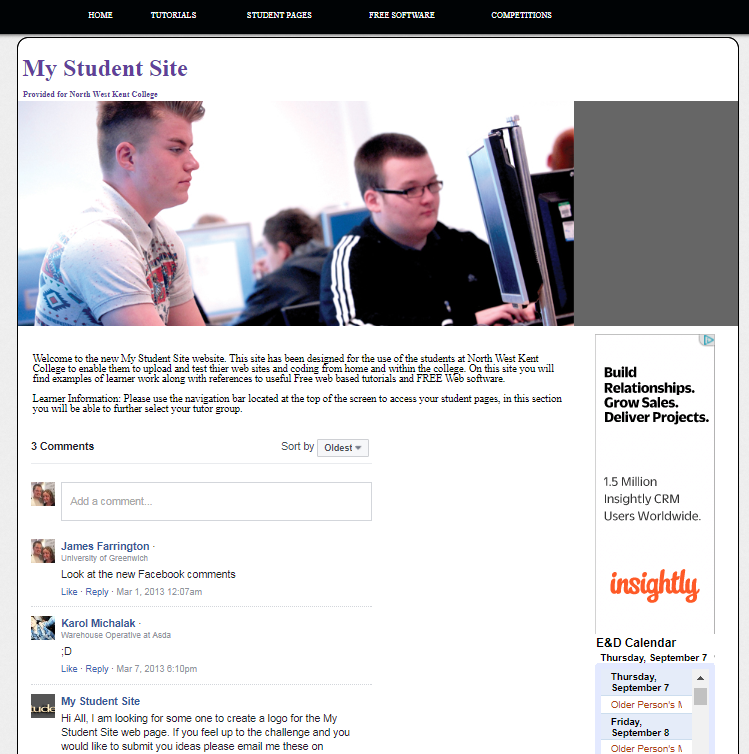


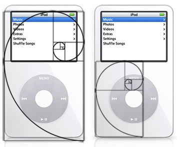


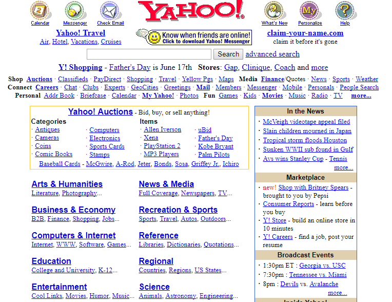
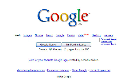
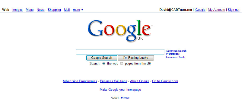
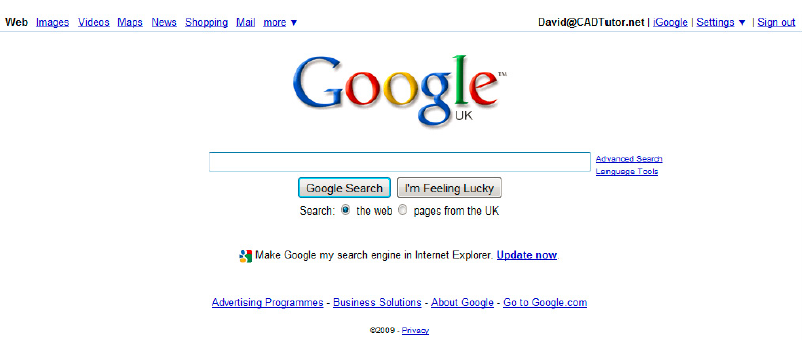
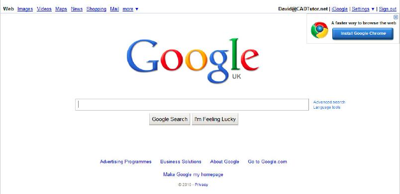
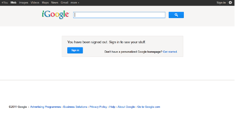
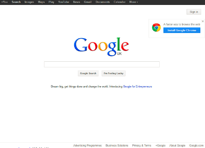
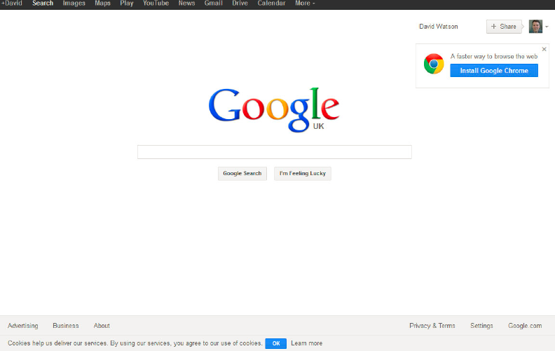
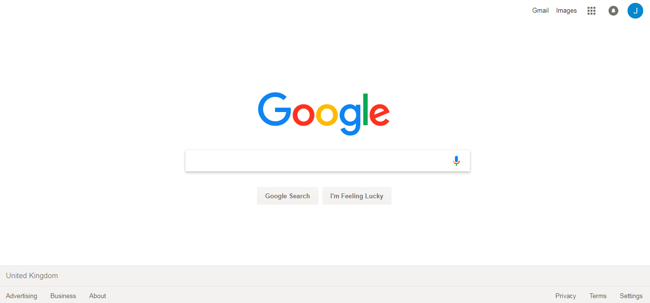


.png)


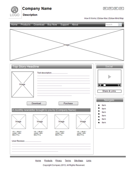


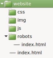

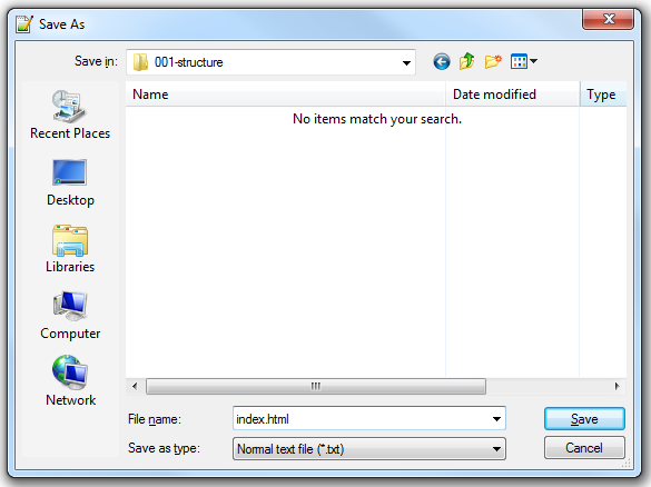
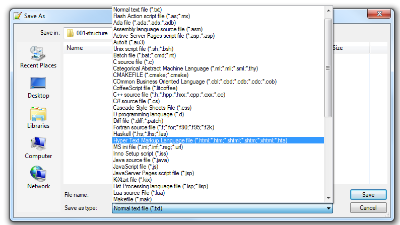

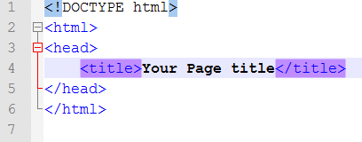


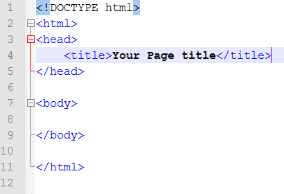
.png)
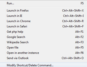


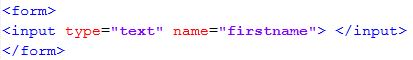
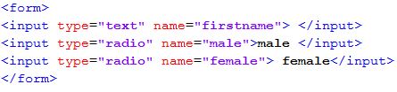
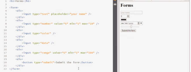


